- Part 1: Initial Thoughts
- Part 2: Last of the Monthly White Dwarfs
- Part 3: Warhammer Visions
- Part 5: Parting Shots
![]()
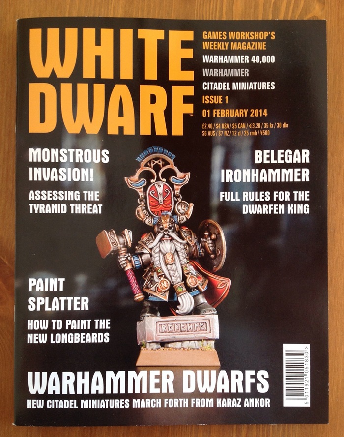
Next we come to the reincarnated White Dwarf itself. It’s a fitting cover. Interesting that they’ve gone to issue 1.
 Let’s start with a look at that mission statement from GW (on the wrapper of Warhammer Visions):

This time, ignore the top bit. So WD is “all that’s new and exciting in the hobby”. Well breaking that down, “in the hobby” is redundant as they never talk about anything else, and “exciting” is also irrelevant as they’re obviously going to think that. They would never admit to talking about something “new and dull in the hobby”, would they? That leaves us with “all that’s new”. OK, that’s simple: the subject is new stuff this week. The detail below is more exciting to me: “painting guides, modelling articles… gaming commentary.” That might be worth reading.
The editorial says much the same thing with more hyperbole.
Format
Physically, this is the same page size it was before, but less pages (32). This slender form has caused a change in binding (it’s gone to “saddle stitched” – stapled as you might call it). This does mean that it actually lies flat when you open it, which would have been nice for a picture book like, say, Warhammer Visions. Hey ho.
Gone is the swanky spot varnish on the cover (cheaper and easier not to have it). Still, the cover is nice and looks indistinguishable from the previous WD style. As always, the print quality is excellent.
As there is so little change apart from technicalities and size, there isn’t much to discuss. It’s obviously smaller as they are releasing it 4.3 times as often, so there’s no mystery there.
Content
How do they do then? Hyperbole and marketing blurb aside, what do they squeeze into the new Dwarf?
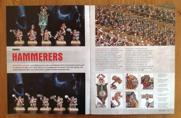
The main focus this week is the new Dwarfs. Each of the new releases gets 1-3 pages of pictures and background. These are nicely done mixtures of background, photos of close ups of various details on the new models, and occasional personal commentary on favourite bits. The text seems reasonable for a brief piece of this kind. If you are seeing the Dwarf models for the first time, or are looking at them anew in the light of the new toys, then it does its job. The photos are good too. Although they aren’t specifically about painting there are some lovely crisp close ups that show some interesting detail. The reddened nose on the Slayer is particularly nicely done.
The one thing I find missing is pictures of the sprues themselves. However, that would give a different vibe to the thing which is of top notch painting and shiny presentation. It is, after all, an advert, so fair enough.
 We then have some Black Library stuff and a mention of Warhammer Visions. Not of interest to me, but again, fair enough. GW seem to make quite a bit of cash off the novels, and so it’s only sensible to push them.
Next up we have Jervis, and he’s got a little mini game to play. This is an alternative to rolling to see who goes first in a battle and is a great idea. The game itself is a variation of a classic push-your-luck dice mechanic and seems to work fine. Personally I found the game itself a little underwhelming and I didn’t like that it was entirely abstract and unrelated to the armies in play. I do like the general idea though, and it’s something I’ve been working on for God of Battles as part of the campaign rules we trialled a few months ago. Again, as Jervis and I are of a similar vintage we’ve both seen this before. Giving it a shiny polish for a new generation is a great idea. A practical mini game in a White Dwarf: that’s a good thing.
After that there is a talk about how the new Tyranid codex has changed the army and what that means for Nid players (and their enemies). Now I don’t play 40K, but even so the article was an engaging enough read. They asked the views of several different players and I thought that worked well to give a rounded view of the new codex. Whether they’re right or not I couldn’t say. What I can say is that it felt like they were enthused and engaged themselves. I didn’t get that feeling from the last monthly issue.
The Paint Splatter article was a perfect illustration of why you need commentary as well as paint swatches. The personal comments from the painter weren’t the most insightful thing I have ever read on the topic. Having said that, what it did do well was tell a story and make you want to look at the pictures as illustration of that story. It gives the article a framework that makes sense which the Warhammer Visions Paint Splatter article sorely lacked. There I get some pictures. Here I get an explanation of why he chose the colours he did and, equally importantly and impossible to show in the WV format, what he did not use and why. A handy little painting article.
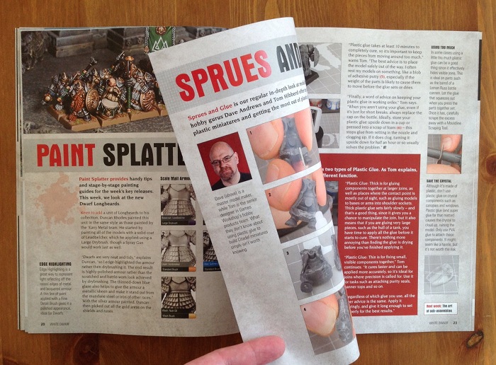 Following on from the painting is a little article about plastic glue. This is a little gem of a piece. Often this sort of mundane hobby detail is lost among the shiny new toys and it is actually really important. Before you can do the fancy stuff, you need to understand the basics.
We then have the rules for the Dwarf character Belegar and some commentary and designer’s notes on him and the regiments. Again. I thought this was well put together.
At the end we have a few pages of snippets. These include a rather lame customer’s letter (actually, it’s the answer that’s a bit lame), a reader’s model, a how to paint stripy trousers, plus some random factoids from the Warhammer universes. The best bit is the nicely written Bluffer’s Guide to Dwarfs. It’s only half a page, and it didn’t tell me things I didn’t know, but it made me smile.
Thoughts
I find myself liking this mini Dwarf. It has a lot more charm than the previous (monthly) issue; a lot more life and excitement. Not, perhaps, as good as it was in days of yore, but that sort of thinking may all be nostalgic twaddle on my part. I need to go and check.
I thought that the only entirely unnecessary waste of paper were the two pages devoted to plugging Warhammer Visions.
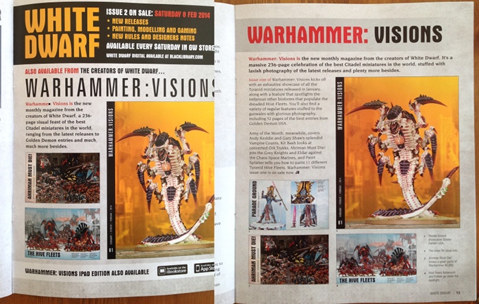 Even though you’d have to be blind to miss the promo if you’re anywhere near the GW hobby, it’s new, and it’s a sister mag, so you’d expect White Dwarf give it a mention. But in as slight a volume as this, to dedicate two whole pages to near identical images (see above) and copy is just wasteful. It’s not like there are hundreds of pages to get lost in and miss it. In a volume this small every page counts, and there are plenty of more interesting things to do with that inside back cover.
Other than that I think this was a good effort. As a first issue in this new format this sets quiet a high bar to maintain, and that maintenance will be a challenge. Still, it’s not like they didn’t know that when they started.
Is It For Me?
Well it’s clearly not aimed at me. I’m way too long in the tooth for much of this to be new, and I understand that. Despite this I find myself quite drawn to the new White Dwarf. It comes across to me as being quite a cheery place, and that’s the core of a fun hobby. If I was still steeped in GW I would be pretty happy with this as a magazine.
So would I buy it again? Actually, I might. I’m not too proud to say that I forget stuff and even the basics of painting and modelling are worth being reminded of and having reference for. I also spent over 25 years playing Warhammer. Even if I don’t play it now I have a residual fondness for the background and the story. So for the low price point I might be tempted.
What puts me off, and what makes it far less likely I will get it, is the simple fact that they have made it physically awkward. I could buy it digitally, but I don’t want a digital copy. Again, being long in the tooth I’m not of that generation. I like a real magazine in my hands. I do use digital copies of rules all the time for work, but not as my primary tool.
If I want a real copy then I’ve got to go two hours round trip out of my way and £3.50 extra to get it, on top of the cover price. Is it worth £5.90? Not to me. So because they won’t distribute this to my local newsagent or supermarket (who both carried the old monthly WD and now carry Warhammer Visions), I am stuck. Well I won’t weep too long. There are plenty of other magazines I can get. Stay tuned for reviews of those.
At the end of the day though, this is partly what the new WD is for: to drive people into the stores. Are they worried that some, like me, are too out of the way for this to be practical on a weekly basis? I very much doubt it. For their core audience I can see this being a very clever move for GW and wish them well with it. If they can maintain this quality then GW fans should be happy.

Aside Number 1
Dwarfen? Is this a Tolkein thing? When I was in GW we would have been shot for using this word. He was a Dwarf King.
Aside Number 2
Stunning? Another word we had on the verboten list. Actually, stunning was streng verboten and underlined twice for emphasis. The only instance we were allowed to even consider using it was to refer to the properties of a large, heavy object that had been rapidly brought down on someone’s head. That was stunning. Everything else wasn’t.
Aside Number 3
When did Dwarfs get so tall? The short folk seem to have undergone another change in physique with this wave of releases. It’s not necessarily good or bad, it’s just a change. One of my first armies (I started with 2 at once) were the Dwarfs, so I’ve always had a soft spot for them and kept a weather eye on how they looked. The leaping Slayer is the extreme end of this new dynamism, but for scale it’s Belegar who looks most strikingly different to me. He actually looks tall. I wonder how big he really is.

Thoroughly useful review! Thanks for putting the time into it (and the visions one too).
Dave
I could have done with a stripey trouser guide 2 weeks ago, go figure.
I was toying with the idea of picking it up and it’s “no longer available” on the GW site. Which is interesting because I was going to say that even though I’m only 15 minutes walk from a GW, I damned if I’m going to go down every week to see if it’s got stuff in I want and that’s before we even talk about the 100%+ price increase.
I can’t see it as a clever move to be honest. First, such a move is an obvious sign of distress and failure in strategic policy. Secondly, and this is being borne out by comments by store owners that participate on various forums, making it hard for people to get your product doesn’t lead to people going out of their way to get it, it leads to them saying “screw this” and either moving to another company that wants to meet their needs or just dropping out of the market altogether.
Sorry, I should have been clearer. When I say it was a clever move, I mean within the self-imposed context of their own GW culture. It’s not the smartest thing I can think of doing by a long chalk, but GW will simply not countenance most of the better ideas because of the internal mindset. Whilst I think the idea is clever within that limited framework, I think that in the real world the idea of not distributing the new WD is hugely destructive of their marketing footprint for the second reason you suggest.
As their current trend is towards relieving a decreasing number of individuals of a larger amount of cash, perhaps this should be seen as a rite of passage. If you go in every week for WD then you’re ripe for the picking?
I’m not convinced that this is an “obvious sign of distress”. I’d rather imagined it was a reflection of the change to weekly releases as was suggested in the comments in an earlier part of this series. As the main advertising arm they are moving into better lockstep with that. Now the driver for that decision on release schedules is a different question.
Excellent article! I found myself thumbing through the new White Dwarf at my local shop as well despite my resistance to GW. I’d like to see more painting technique and terrain building articles within it however, leaving the showcase and advertising to Visions. Maybe having a section of selected “house rules” or alternate lists for 40K and fantasy, or even exploring simple campaign systems within their games would be a big draw for me, and i suspect many other people as well. Overall GW needs to make WD a gaming mag that gives gamers unique and playful ideas, and less of the straight GW buy everything rhetoric. Visions in my opinion is a waste, though this reboot has some potential.
£5.90 for 32 pages??? Perhaps you could do a chart comparing a “price for page” for all the magazines you’ve picked up recently as £5.90 seems awfully steep – especially for a weekly title.
Been really enjoying this series of articles, even though I’m not a GW customer and haven’t picked up a copy of WD for a couple of years. Your review of this new weekly had me quite interested in reading their dwarf material until you mentioned the price of the magazine.
It’s not 5.90
It’s 2.40 + the 3.50 that Jake somehow calculated as his personal cost for going there-and-back-again to pick it up.
Not that 2.40 isn’t hideously expensive for 32 pages.
Thanks for clearing that up. Yes, £2.40 is a more acceptable price for a magazine, but perhaps not one with only 32 pages
As they don’t distribute this to the places I could get it before (when it was monthly) if I want this I have to pay a £3.50 tram fare plus two hours of my time to go and get it. That’s on top of the actual cover price. Hence the £5.90 total.
“Dwarfen” is GW’s copywritten spelling of the word “Dwarven.” That’s right, they put a copyright on a misspelling.
Tolkien misspelt it first when he changes Dwarfs to Dwarves.
*changed
Come on now, we all know there is nothing GW won’t do.
I also thumbed through the pages of the new WD (in a modeling shop in Germany that only has about 20 GW boxes available). I was very intrigued by the new weekly format and sincerely hoped that GW would leave it’s pagelong advertising to the monthly magazine. Well, I was wrong. The first real article begins on page 14. Of 32 pages. 14!! That made me sad.
Totally agree with both this review and the one of Visions. I actually quite like the weekly and doing a price/content comparison to White Dwarf 53 which I have in my collection as I’m just THAT old, and adjusting for inflation, it actually comes out quite well. Visions though is totally worthless. It’s completely devoid of any content and I can only think it’s aimed at painters of Golden Deamon standard. For anyone else it’s a case of ‘Here’s some of our models painted to a standard you can’t achieve and no, we’re not going to help you achieve it because we’re not going to tell you anything’.
Sadly my White Dwarf subscription has switched to Visions, or at least it has until I cancel it tomorrow.
A bit off-topic, but your aside got me quite curious. What was the rationale for “stunning” being “verboten”?
It wasn’t me that imposed the rule. I think the reasoning was that it had been (and is again) widely overused and therefore repetitive and dull. It was an attempt to encourage some thinking and variation of language rather than the lazy use of stunning for everything.
Pingback: Reviews of Warhammer: Visions and White Dwarf | Scent of a Gamer
fewer pages, not less. If we’re quibbling about things that should be verboten 🙂
I know, I know. It’s all part of my human frailty. I understand the technical correctness, I just don’t like the formal way it sounds.
And I will reserve the right to be entirely inconsistent and demand the pure and virtuous “proper” use of other terms 😉
I thought White Dwarf Weekly #1 was alright for content (hardly the golden age, but acceptable) but £2.40 – whether or not you also need a bus ticket to go to the store – is a bad joke. If you’re going to buy it every week, it’s £9.60 a month, more than double the price of the old White Dwarf, and more than triple the price of the old White Dwarf by Direct Debit subscription… for about the same number of pages.
*Then* when you add on bus tickets or even just travel time it gets even worse.
In my view they could have printed this on cheaper paper and given it away for free, it’s only 32 pages. Or kept it as-is and cut the price in half, with further discount by subscription. As things stand the price is a rip-off.
But at least it’s not an insult to my intelligence, like Visions.
Pingback: The Price is Knight | Scent of a Gamer