![]() Lords of War is a fantasy card game depicting a battle between two armies. It comes in packs of paired armies, though you can actually fight any army against any other, and there are rules for making your own mercenary decks by mixing up Dwarfs with Orcs, Templars and so on.
Lords of War is a fantasy card game depicting a battle between two armies. It comes in packs of paired armies, though you can actually fight any army against any other, and there are rules for making your own mercenary decks by mixing up Dwarfs with Orcs, Templars and so on.
As I write this, there are three twin packs available for a total of 6 armies: Orcs, Dwarves, Elves, Lizardmen, Templars and Undead. There is also a Weather & Terrain pack that I’ll look at in a separate article. Finally, they have just started a Kickstarter campaign to expand on the armies they’ve already done.
I’ve bumped into the cheery fellows behind this game a few times, and at the last UK Game Expo I had a chance to sit down and play some games with their demo team, including against the designer. They were kind enough to give me the copies for this review.
As is my wont, I play things several times before I write a review. Well, now that I’ve had a chance to get LOW on the table in various combinations of armies and against different opponents, here I am. In this part, I’ll discuss what’s in the box. In part 2 I’ll look at game play. Part 3 will be conclusions and a variant I thought of which you might like to try.
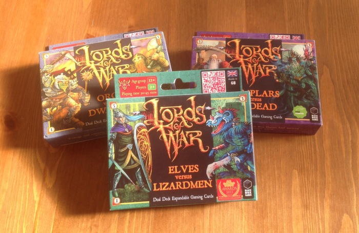
Let’s start with the box as you buy it. The twin pack is a convenience that allows you to make a single purchase and have a pair of armies, the rules and battle mat in one go. In other words, one pack is all you actually need to play. Additional packs simply offer more choice. This format also does well as a distribution tool as it can be placed beside a till and used as an add-on sale. Good for stores, and well-liked by distributors. Black Box Games have thought about this 🙂
So what’s in a pack?

Each of the packs comes with two decks of 36 cards, one for each army. It also includes a paper gaming mat and a rules sheet. It fits neatly in the box, and as long as you can fold the rules and map back up then it goes back in for storage neatly too¹. With the amount of stuff I have in my study and on my games shelves, being compact is definitely a plus point for me. 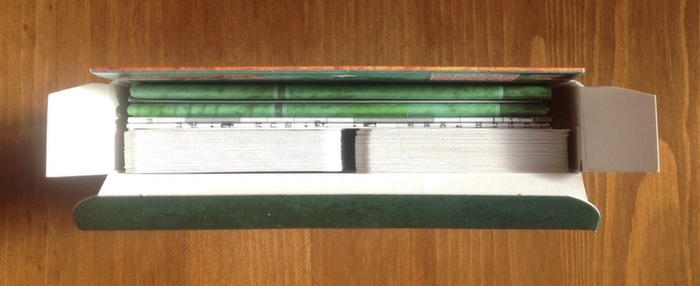
The Cards
The cards are fairly normal playing card size (57mm x 88mm), though a little narrower than the card sleeves I have to hand. I don’t plan to put them in protectors as that would stop them from fitting in the box, so that’s not an issue for me. Just thought I’d mention it.
Their quality is excellent. I can’t see a black core, but also can’t see any show-through either. They have a nice snap and shuffle well. The surface is smooth, which I personally prefer to linen finishes. printing is vibrant and none of the cards I have seen suffer from any register errors. All told: a good quality product.
All the cards in the various armies have the same design on the back. On the upside this allows you to mix and match to make your own mercenary armies. Unfortunately it makes sorting them out slower if they get mixed up. Not a big issue, though occasionally things creep into the wrong deck. Personally I’d rather forgo the mercs angle and have different backs.
The place the cards really shine, and a major feature of the game, is the artwork.
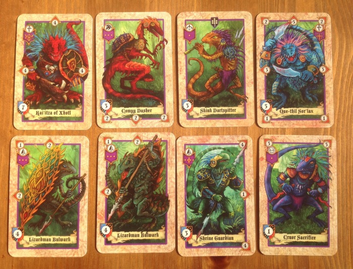
All the cards have gorgeous, colourful art. The style is most reminiscent of old Fighting Fantasy gaming books, with smatterings of similar vintage Warhammer, children’s book illustration and suchlike. It’s intended to appeal to a wide audience, and the reactions I’ve seen shows that their efforts and experimentation in this regard has paid off: almost without exception people react in a positive way.
Much of the art is repeated across cards as most non-leader cards appear two or three times in the deck. To add variety, the art is usually mirrored, and sometimes recoloured. This gives the impression of more different pieces of art and works fine for me. The only grumble I have heard is a lack of consistency about whether the facing of the figure depicted in the art matches the directions of attack (which I’ll explain in part 2). Can’t say it worries me, and it’s obviously helped to keep the costs down. Seems like a sensible decision.
 Each of the Command cards has its own unique piece of art, which helps add some character to these heroes.
Each card has the icons and stats required to play written on it, so there’s minimal looking up required during play. They also have icons for a card’s rank, which is only used in deck building and for distinguishing Command cards (for victory conditions). My only real complaint about the cards is here: the symbol for Command and Elite is much too close, and I frequently muddle them up in play. Both are a cross surrounded by four dots. See for yourself:

On a white page in the rules they don’t look bad, but among the rest of the art they aren’t nearly as clear as I’d like – especially when you have one or the other without the comparison. This doesn’t break the game by any means, and I can tell them apart when I think about it; it’s just irritating that I have to stop and think every time.
Niggle aside, the cards are lovely to look at and work well in the game.
Battle Mat
This is a fold-out sheet of paper, like a small poster. It’s a grid on which you pay the game, though the rules do suggest that you could play on a table and simply imagine the grid. I know that some people are very anti-paper mats, but I’m not one of them. It’s nicely printed, bright and cheery and fits well with the card art in style. Different decks have different mats. However, at the end of the day it’s a simple grid, so there’s not much to comment on. I suppose one thing that might be worth mentioning is that if it was a heavier board it wouldn’t fit into such a compact package.
Rules
The rules are on a small black and white poster which folds out like the battle mat. I’ll discuss the game play in part 2.
The rules themselves are pretty clear. Note that there are slight differences between the rules in the different sets. At least one game feature appears in later decks (moving cards) which is not listed in the early decks that have no use of it. This doesn’t cause any problems as long as you remember to refer to the later version of the rules if you have a query and are fighting armies from different packs. Otherwise you might get confused when the rules for moving units aren’t on the rule sheet…
The Whole Package
All told, Lords of War is a neat little game, well packaged in a practical format. It’s quite inexpensive when you consider one purchase buys a whole game. It’s also easily portable and will make a reasonable filler.
The art is very attractive and I can see this being a good way to introduce younger players and non-gamers to gaming. As long as they don’t mind a lot of carnage 🙂
Next up, how the game plays.

1) I’ve not found this a problem and I’ve unpacked (and repacked) each of these boxes several times.

Thanks for the review Jake. It looks like a portable version of Summoner Wars.
I’ve not got round to SW yet. I have, however, watched their how to play videos and LOW is clearly in a similar vein: both are cards on a grid to represent a fantasy battle. Even so, there are some major differences – the combat mechanic among them.
Hi Jake. Nice review. I played it yesterday at the SPIEL 2014 in Essen (against Olly, a nice lad working for LOW) and was really impressed by the game. I can only recommend it. It has a lot of tactical depth and although you can complicate the game as much as you want (terrain, different weather and building your own decks). I am going to order some packs (I loved the Templar deck) as they are also available in German. Btw in Essen they also sold high quality playing mats, which you could use instead of the ones that come in the box. Looking forward to see the following parts of your article.
Thanks Mephisto. I’ve not seen the fancy battle mats yet. I’ll have to keep my eyes open for those.
Pingback: Review: Lords Of War – On The Table |
“The style is most reminiscent of old Fighting Fantasy gaming books, with smatterings of similar vintage Warhammer, children’s book illustration and suchlike. ”
Yeah, I do like the art a lot. It’s got a Blanche feel. Got a bit of the Chaos Marauders to it. Not entirely sure about the bits where the kickstarter backer portraits came complete with spectacles though.
They do stand out a little, with the rendering of the backer’s aces being a more detailed level than the norm. I don’t begrudge them that though, and it’s amusing to play “spot the backer” too. How many can you find without the tell-tale specs?
🙂