People use the word unique way too often in marketing blurb. It’s not a complicated word to understand, but it’s often used incorrectly. This makes the people using it look sloppy and careless.
If you’re writing advertising blurb and you’re tempted to use the word, think carefully about whether it’s accurate or not. Unique is a big claim, and very often it makes you look like either a liar, or someone who doesn’t know the market. Neither is good. It’s a fair rule of thumb that whenever you make that claim, someone in the audience will be happy to point out your error, and where that rule has been used a dozen times before. In reality, little is genuinely new in game design, and that’s absolutely fine. A game doesn’t need to include a unique new rule to be brilliant.
When people abuse innocent words we send in the heavily-armed rotating dinosaurs.
Of course, I’m talking about this because I’ve been reading Kickstarter campaigns again, and it’s cropped up several times. In no case was it true.
Also, while I’m on my soap box, unique is not a word you can qualify. You can’t be a bit unique, or very unique, or most unique, or more unique than them. In fact, you can’t be anything unique. You’re unique or you’re not. Exactly like its very specific meaning, it stands alone.
Rant aside, I was going to say that I hadn’t been especially inspired by Kickstarter this week. However, when I come to write this, it turns out that I’ve actually got quite a few interesting campaigns worth mentioning today.
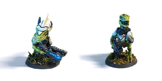
One recurring theme is STL files for printing 3D miniatures and scenery. There seems to be an especially plentiful crop of these campaigns at the moment, and if you have a 3D printer you are spoilt for choice. I don’t, but I still like to explore them because I’ve always been a fan of miniatures. Raygun Raptors struck me as a particularly slick and well-presented example of the type, if you’re after an example.
I’m Currently Backing…
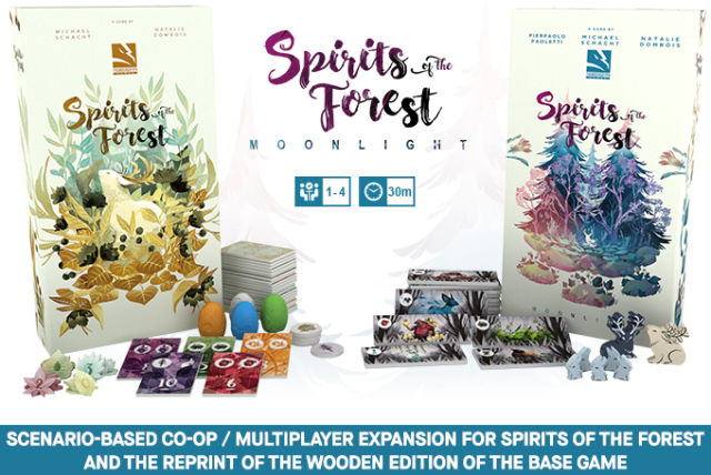
As I write this, I’m backing the Spirits of the Forest: Moonlight expansion. In the end it was the fact that the wooden version was KS only which made me back it, despite the fact that with tax and shipping it will be very overpriced. I already have the wooden version of the core game, so if I want this expansion then I’m not left with a lot of helpful choices. It feels a bit forced, but I could always say no.
That finishes in a couple of hours, so I’ll be back to backing zero campaigns again. Strange for me.
Also of Interest
There are a lot of intriguing campaigns on at the moment.
When I read through the KS campaigns, I watch the main video, then a how to play or review video, and quickly read the page. Unless it’s standing out at that point, I discount it. It had its chance to impress and it failed.
Of the remainder, I keep them on an open tab to look at more closely over lunch breaks and whatnot. This is where most of the following are currently sitting, so I’ve not been through them all in detail yet. Still…
Looting that Labyrinth.
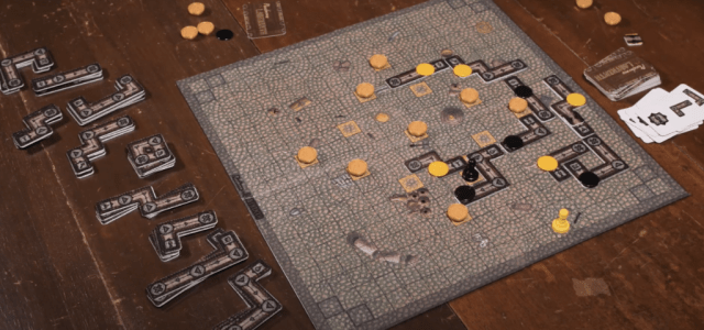
The first one reminds me of Ricochet Robots, which I’m very fond of. This new one is called Looters of the Labyrinth. What I like here is the clean and simple design. It’s pared back to the bones of the idea, and that’s just what it needs. No unnecessary frills. There’s a month left to go on this, though it’s unlikely he’ll fund. Shame. Let’s hope he comes back for a second try.
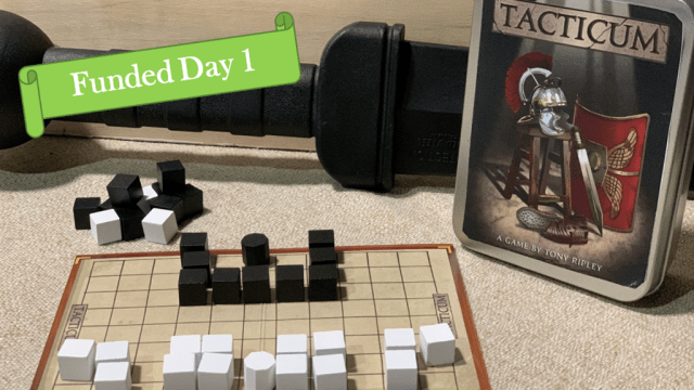
Another simple abstract that caught my eye was TACTICUM. As with Looters of the Labyrinth, I can’t see me getting it on the table, so I’m not backing it. However, I am fond of clean and elegantly presented abstracts, and these both tick that box. I almost backed them anyway. TACTICUM does an especially nice job of being small and physically contained without sacrificing what it needs to be in terms of game design. Unlike Looters, it’s funded too. Congratulations to them!
Finally, there are a couple of very different campaigns I’d like to mention in the RPG neck of the woods. One is the straightforwardly-named These Monsters Have Minds Of Their Own. This is an AI system for taking a bit of the load from the GM by automating some of the monsters’ responses. It’s a neat idea, and one that I’ve done versions of myself, which is partly why I’m interested. I have a professional curiosity to see how they’ve tackled design problems I’m familiar with. It’s the sort of thing I might buy to read, and never expect to use in anger.
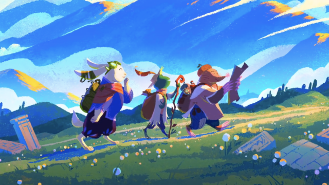
Calm and pastoral art from Wanderhome.
The second RPG campaign I’m still looking at is the very successful and somewhat eclectic Wanderhome. There’s a bunch of sample files to download and read through, which is a sensible approach for something nonstandard. Always fun to see someone exploring variants and pushing envelopes, so I look forward to reading these. Again, it’s unlikely to be something I play myself, but it could well be something I back to read.
And that’s all the Kickstarter thoughts I’ve got for you this week. I’m off back to finish the corrections on my latest article for the Game Design Mastery Patreon. If you fancy reading an in-depth discussion on Narrative vs Balance-focussed Game Design or one of the other topics I’ve already covered, then why not pop on over and sign up?

You know what I hate about games these days? Do you want to know what I hate about games these days? Probably not, but I’ll tell you anyway.
Childish cartoon art. Almost every game, even those targeted at adults looks like it’s designed for children ages 4 to 10. Bright colors. Cartoony art. I know the reasoning behind this, to broaden your audience and rope in parents who will buy it as a family game to plonk on the table in an attempt to get their brood away from tv or smartphones and do something together. Fair enough for simple children’s stuff. Though even there… But for more involved games that are supposed to appeal to the same 20-something who like watching gritty stuff like Game of Thrones??? Or is it because mediocre kiddie artwork is easier and therefore cheaper? You sometimes get that in DIY miniature games or RPG, this cheap art that does no justice to the contents of the game or setting but was clearly all the publisher could afford. I think it’s sad. Battlesworn comes to mind, but it’s not the only example. If you can’t get decent art, then go full minimalist. And damn the chumps who can’t handle slabs of text and bare tables, they’re not worthy to join the elite group of gamers who do recognize greatness when they see it.
Art direction, done well, should take into account a great deal more than merely what fits the budget. You’ll always have options for style and tone, and choosing what is appropriate for your game is the key.
If your game is about scary, murderous, blood-spattered monsters who lurk in the dark forests, then you’re unlikely to need a lot of pastel pink in your art. On the other hand, if your game is about vibrant coral reefs in the bright, clear waters of the tropics, then you’ll want a very different palette.
Art style often sets both tone and expectation in your audience. A good example is retro games using pixel art, or black and white ink drawings to evoke a different era, even though we are past that now. Another example would be games set in medieval time mimicking tapestry, woodcut, or stained glass windows to create the right atmosphere. This is great when the game follows through on that promise; bad when it doesn’t.
I don’t think that there is a single best style in use in games other than to say “good art that’s appropriate”. For me, the worst style is simply the one that doesn’t fit, and that’s different each time.
The art for Battlesworn is an interesting one to bring up. It doesn’t look cheap or easy to me – it’s just a particular style. This isn’t something a child would do. However, while I don’t know the game, I do agree that it seems like an odd choice of style for a skirmish game. Looks more like they’ve chosen a style they like without marrying it closely to the game itself. That said, if the game had a range of miniatures which used a similar aesthetic (Spyglass comes close) then that could make perfect sense. As I think you can use anything with them, it seems out of place. Its tone, and therefore the expectation it sets up, does not match the game. That’s its failing in my book. The art itself is a competently done example of the style.
I’d be interested to hear some other examples of which games you think have inappropriate art.
When I say “childish”, I don’t mean art made by children, I mean art made to appeal to kids: clear & simple, bright colors, cutesified or cartoonized, toned down & sanitized to make sure it doesn’t upset anyone. I’m amazed at how often you see the later in games where the content itself is not nicey-nice or sanitized at all.
Anyway… Battlesworn. It has boring & simple drawings of the type you find in corporate presentations & brochures throughout the world. It might not have been easy for the first person ever to come up with this, but now that it exists it’s a simple & easy style to apply. Drawings in this style require a lot less than the intricate drawings of say, a John Blanche or Ian Miller copycat piece. So there are plenty of artists who can handle it, and it shouldn’t be too difficult to get a relativeley cheap one. The disconnect between content (a fantasy skirmish wargame) and presentation (bland corporate instructions hopelessly trying to look exciting & cool) only confirms my suspicion that cost was a decisive factor. Which is a shame, Battlesworn is a really great little skirmish game, quite fun. There are ways to keep costs down & still make a visually attractive game, perhaps the person who commissioned the design simply didn’t have enough artistic sensibility.
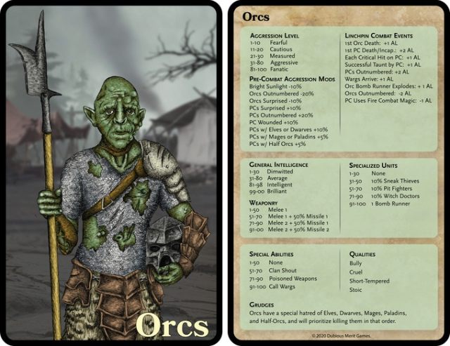
Other examples… there are 2 right in your post: Looters of the Labyrinth and Tacticum, both of which mix abstraction (which I can respect if done well and not simply out of cheapness) with play-it-safe lowest common denominator art. Have you seen that orc??? How can anyone get excited over such amateurism? Or that box art for Tacticum, made to impress a 7yr old? The guys behind these kickstarters possibly feel they’re doing their best, but the result is pathetic and off-putting and to me an actual dealbreaker.
Much of the world we live in is sadly “toned down & sanitized to make sure it doesn’t upset anyone”. I agree that art is sometimes a victim of this same trend. However, I’m not convinced that this deliberate appealing to children is a problem on anything like the scale you suggest. Certainly, I can’t think of any discussion I’ve ever had with anyone in the position to make that call who’s claimed that as a reason, and I’ve spoken to many. Sure, the odd boob gets covered up, and some gore is toned down, but that’s on the scale of an individual piece rather than changing the whole approach for a game. Your other problem is with cost being a consideration, but when is it not in business?
You clearly have very strong views about this, but they’re not facts, they’re opinions. personally, I think the TACTICUM box art is appropriate and fine. The logo for Looters is clearly done by an amateur, and the only other art for board and tiles is flagstone floor, so hardly something you’re going to get Leonardo to do. They both seem to be single-man operations doing this as a hobby, so paying top end professional artists is simply an unrealistic expectation. I don’t think that the Looters art really detracts from the whole. I do, however, have sympathy and understanding for their position and budget, so perhaps I’m more forgiving.
I’d be interested to hear what you’d have done differently in both cases. What do you think would have made such a difference that it would have been worth the financial investment? High quality art is expensive.
Also, note that the very amateur orc is from These Monsters Have Minds Of Their Own rather that TACTICUM or Looters. I agree that it’s not professional standard by a long way. however, it’s in an RPG supplement, and these tend to have a lower standard of what’s acceptable. That doesn’t make it good, it’s just not as much of an issue for that audience.
I agree that Battlesworn made a strange choice of style for that kind of game, but I still don’t agree that it’s a bad one, per se. I take it from your comments that you don’t draw yourself. It’s not as easy as you make out (though it is fairly fast once you learn it).
John Blanche or Ian Miller are very much more detailed in their styles, as you say. However, that’s not always a good or appropriate thing. Personally, I’m not a fan of Ian Miller’s style and find it has not aged well. It looks dated, overworked, and static. But that’s just my opinion, and I also have some nostalgia for certain pieces. Mr Blanche is an extremely talented fellow, and some of his work is outstanding. Some of it is not. I think there was a point where anything he drew was lauded uncritically, and they put out everything without a filter. Like anyone else, artists have good days and bad ones, and do better work some days than others. Nor do I think that the ideal art for many board games is either Miller or Blanche. As I said before, what’s important is appropriateness, not the style on its own. No one size fits all.
It’s like being “a bit” pregnant! 😆
Absolutely.
(continuing the discussion here, as I couldn’t reply any further on your last post)
Let’s get some things out of the way first: I actually do draw. I follow evening classes in an art academy, your typical combination of still life objects & some live model classes.
Secondly, remarking that what I say is not fact but an opinion may be true, but it’s also trivial. And applies to what you say just as well. But it’s still worthwhile to speak these opinions out loud and discuss them with the gloves off, beacuse they are reasoned opinions based on arguments, and that can make people think. Which is good and not done often enough when it comes to evaluating gaming stuff.
You seem to think I want everything going full horror with tons of blood spattered graphic nudity. What I’m really getting at is more the difference between something like Prince Valiant and Disney’s Black Cauldron. These days we get lost & lots of Disney, and almost no Prince Valiant. And yes, I do believe the reason behind this is the desire to *also* appeal to kids, mostly in the form of signalling that the game is fun for adults, but you can play with the whole family! If it’s never discussed it might be because it’s a default assumption in the industry. Another reason might be a general cultural trend of cutesifying and childification, don’t get me started on that :-p
Don’t defend those kickstarter amateurs. They don’t deserve it. I’m sure they’re perfectly nice people, but seriously, what are they thinking??? That anyone is really waiting for another mediocre product in an already overcrowded marketplace? People should ask themselves some hard questions before doing this. And if the answer is that you have nothing much unique to offer and can’t really afford the costs, then don’t do it. I look at these games with eye of a discerning connoisseur and there’s just no enough there to justify buying in to these. Maybe Tacticum is a fun game, but the ho-hum cover then actively speaks against it. Yes, in material objects I do care about such things very strongly. I know some don’t, like the dreadfully cheap historical wargamers who don’t seem bothered by absurdly bad anatomy as long as the shape of a shako is roughly ok.
Here’s what i would have done differently: for Tacticum, I wuld have used a classic copyright free image for the box art. Something nineteenth century, maybe some tasteful but dramatic etching or a painting by one of those genre painters who did historical stuff. Looters is a lost cause unless you have a budget. If I really wanted to publish a dungeon game, I wuld go rules only, and point people to various resources for material components. It’s not like there aren’t any nice miniatures, terrain or boards available. Or even counters, plenty of options there. For the rulebook, I’d keep the artwork limited. A strong cover, maybe 1 or 2 interior illustrations, and of course a solid layout. Nice fonts for the titles & subtitles. And you know what? I’d still offer the pdf for free, because it’s a vanity project and what I want is recognition and people playing the game, not the measily amounts you’re likely to make if you charge. If it takes off and becomes a cult hit and I think the gamble could work, I might later on commission some cool miniatures to offer for sale. But only if I can afford to lose the money I’d have to put into it to see it through.
Now here’s something that I want to know: why would Ian Miller be unsuitable for board games? You do know he’s actually working on one? 🙂
You’re absolutely right that it’s worth discussing things like this, and I also agree that there isn’t a lot of talk about art for games other than “this is good” and “that’s bad”.
My examples of nudity and gore being censored weren’t a reflection of what I thought you wanted, but simply all that I’d seen censored. I’m still a little unclear on what you’re proposing. You seem to be saying that there is a right and a wrong way to do game art, and I’m not convinced. I would argue that there is no single style which fits all projects, and that in many cases the value of a particular piece or style of art in highly subjective.
When it comes to quality, we can agree that some art is technically poor (the orc, for example). However, it doesn’t need to go much beyond technically competent to become mostly a mater of taste. Hence my argument not being based on taste, but appropriateness. This is a vague term too, though perhaps less debatable as it is to do with adherence to norms, and they can be researched.
I have more sympathy for the neophyte than you seem to. You’ve got to start somewhere, and the best lesson is one learned by doing. I’m also personally invested here as people who are new to game design occasionally come up with something that is new and shiny because they don’t know any better. At least, they sometimes lose their way and avoid the well-trodden paths we have seen done to death. And if they are couched in terms of poorly illustrated games, then I still get the new idea, and I can look past poor art.
If their first effort does poorly or is derided because of the art, then they will learn for next time. If you simply disbar them until they come up with the cash to pay someone better, then that may never happen. I can’t think of lots of great-looking games that use only clip art or copyright free stuff. We are back to the old situation of needing to mortgage your house to self-publish, and I’m not for that at all.
Personally, I find clip art and stock images very rarely work. I’ve seen a bunch of games using them, and it’s very hard to make the art work on the scale games need. You could do it if you had, for example, all the illustrations from the original Sherlock Holmes serialisations, and used it for a game about the great detective. Most other instances which have tried this route look jarring and inconsistent as they’ve rummaged through things that were originally in varying scales and styles and they do not sit well together. At least, that’s how I see them.
I didn’t know that Ian Miller was working on a game. I’ll be intrigued to see what he comes up with. The reason I would not put him on my list as illustrators is mainly that his style is so distinctive. That means that it suits only a very narrow band of subjects. It’s also complex and cluttered, and that tends to be unhelpful when you are talking about a game because that needs to be easily readable. Still, he’s a highly skilled professional and I’m sure that he could turn his hand to it, and as he already has fans I expect it to be successful. The idea is just not to my taste. Maybe the reality will be.
More than proposing there’s a right & wrong way to do game art, I’m lamenting what I see as almost a monoculture of childish “family” stuff, which I think is highly inappropriate for some genres and leads to a general dumbing down. To go back to the Prince Valiant vs Disney’s Black Cauldron example, Prince Valiant is for kids who want to grow up, Disney for perpetual seven year olds. Too many creators, for various reasons, go along with this trend, I suspect out of convenience, because of certain assumptions about what sells or simply unthinkingly. Which is why I don’t think the creator is always right.
I love DIY punk attitude and appreciate people’s efforts to design games. What I strongly disapprove of though, is the urge to offer this for sale even if it’s not up to standards. Why can’t people keep their hobby a hobby? It’s like those Patreon clowns who expect people to send $$$ to keep the blogposts coming. In most cases simply sad.
You can just share your creative endeavors for free with fellow enthousiasts, sometimes great stuff comes out of this, and then, later on, might come the time to do something commercial with it. But first learn the ropes. Turnip28 springs to mind. Yes, it will result in stuff offered for sale, but it’s taking the slow route, with lots of open development & sharing among hobbyists. RPG authors like Patrick Stuart or Chris McDowall have also come up through doing mostly free stuff and when they took the kickstarter plunge, they didn’t skimp on production values. Which paid off both financially and creatively.
When I mentioned using historic artwork, I wasn’t thinking of clip art of the “1000 free images of animals” type just plonked down unthinkingly in the text, which is what you seem to be describing. It needs to be quality stuff, and it might have to be reworked and will definitely need some graphic design work to get it to mesh with text & layout. But it can yield great results. I’m thinking of the book covers by a designer like John Coulthart, but there are plenty of less involved covers that can serve as nice examples. So for the Tacticum box this could work out very well, and it won’t be more expensive than that crappola illustration it has now. There are tons of free resources which you can raid, but you will have to put in time and effort.
Some of the things you regard as downsides of Ian Miller’s style are in my opinion great strengths. Being distinctive is good. You want to be distinctive, unless you’re a hack churning out commercial sludge on the orders of others purely to make a living. Its complexity makes it interesting to look at, and for a longer time. There are still ways to make it readable, apart from art there’s also layout and graphic design, and I’m not convinced that would be an issue in the first place. That he has an existing fanbase is precisely the result of having a style of his own. The person who did the Battlesworn art will never sell a game on their artwork alone. Quite the contrary.
When reading your blog I often have the feeling that you’re very much oriented towards lowest common denominator stuff, and that you assume gamers are somewhat dimwitted, uncultured clods who need to be spoonfed and can’t handle anything even slightly complex or unusual. I’m sure there are plenty such people. But far less so in the niche world of adult gaming. Tons of games are being produced for the LCD deplorables all the time, and while some may make their designers rich, most only get modest returns or tank. So if you have to blow your money on the crazy dream of being a game designer via kickstarter, at least show some class when doing so.
To take your last point first, I absolutely don’t think of gamers as dimwitted or uncultured. Not at all. Rather than go on at length here, I’ve decided to write a post about audience and tone, so you’ll see more on this soon. For the moment though, I’d have to say that your assumption is way off beam. If you’re getting that impression then I’ve not explained myself properly. I will try to.
One reason that many artists mirror Disney style is that they like it, and that they’d like a job in the industry. You see that mentioned time and again on artists’ channels. Disney has a big studio and working there is a big plus on a CV. You can see why that would appeal for a budding artist. Does their art appeal to me? Sometimes, and especially in some technical ways, because one could always improve and studying what they do is often instructive. Overall though, I’m not their target audience.
Also, as Disney make so much money, many others emulate them. Usually with less skill. But this is like any other business – wannabes copy those who do well. The market follows the last big success. It’s not what I’d choose either, but the evidence would suggest that it’s how business works. My experience underlines this too: you ask folk what they want and it’s all about new and innovative. But, when you make that, it doesn’t usually sell.