- Part 1: Initial Thoughts
- Part 2: Last of the Monthly White Dwarfs
- Part 4: Weekly White Dwarf
- Part 5: Parting Shots
![]()
I was going to look at the new, svelte WD first, but I got Warhammer Visions yesterday and have changed my mind. I want to start with this:
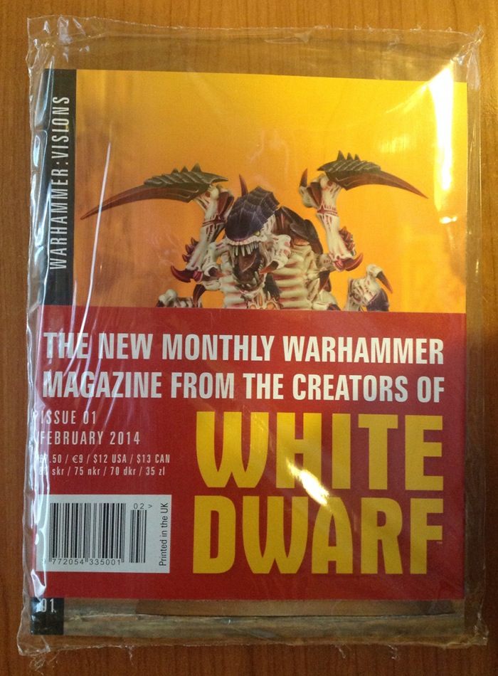
And here it is. This issue, at least, comes in a protective bag for some reason – perhaps to protect the paper wrap. The wrap is interesting mostly for the back which gives a sort of mission statement for both new magazines:

Ignore the bottom bit for the moment and focus on the top half. Warhammer Visions is a described primarily as a “visual feast”. Opening the mag itself has another bit about Wahammer Visions on the inside cover. This says much the same thing as above in different words, calling it a “photographic showcase”. So the aim is pretty clear: it’s eye candy. Fair enough. How’s it do on that?
Format
For some reason, Warhammer Visions is a smaller page size than the old WD. It’s slightly wider than A5 and a couple of mm taller (215mm x 165mm). WD was already smaller than most magazines, perhaps because of its name. The small page size of Visions is married to a large page count (228 pages + covers), so you end up with a short, fat book. They really should have called this White Dwarf…
The cover again has spot varnish on the Nid, and the print quality is, again, top notch. The paper could be nicer.
There is very little text in the mag. This article has several times more text than the whole 230+ pages of Warhammer Visions. What little text there is comes in 3 languages: English, French and German. To be honest, I’m not sure why they bothered. There is so little of value in the tiny captions that they could have been left out entirely. That way they have a totally language free magazine they can sell anywhere.
Going back to the size, it’s an odd one. The only bonus I can see is that it’s more easily portable. Mostly it seems like a poor choice for a magazine dedicated to showing off pretty pictures. Think of normal art or photography books (the obvious archetype of eye candy volumes) and what do you imagine? I think of large format coffee table books; certainly the tendency is towards more space to show everything in more detail and to have lots of shining white to surround and offset the elegantly taken shots. And yes, I did go to art college as well. Look at the shelves in your local bookstore. If it’s anything like the ones round here then one of the few sections where the books mostly stick over the edge of the shelves is the art and photography section.
So, why go smaller?
Another thing that is worse for this diddy size is the gutter. In print terminology, the gutter is the middle of the book, by the spine, when you open it. This is where the bend of the book is worst and where any picture unhappy enough to fall in is lost to distortion. The “perfect binding” (another technical term) used here makes the magazine impossible to lie flat when its open, so it exacerbates the issue caused by a fat volume. This isn’t the way to show off the pictures at their best. Overall, if you’re trying to make something that is all about looks then you certainly wouldn’t pick a small, fat, perfect bound volume to do it in.
So, why go smaller?
Is it simply to make a point of obvious difference between the two? I don’t know. They could always have gone bigger. That would have made more sense visually. The least charitable reason I’ve heard so far is that it’s a better fit for the small hands of the eight-year olds it’s aimed at. More on that later.
Content
Lots of pictures.
No, Really, What’s In The Mag?
OK, in more detail.
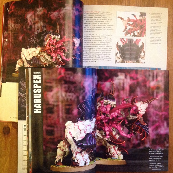
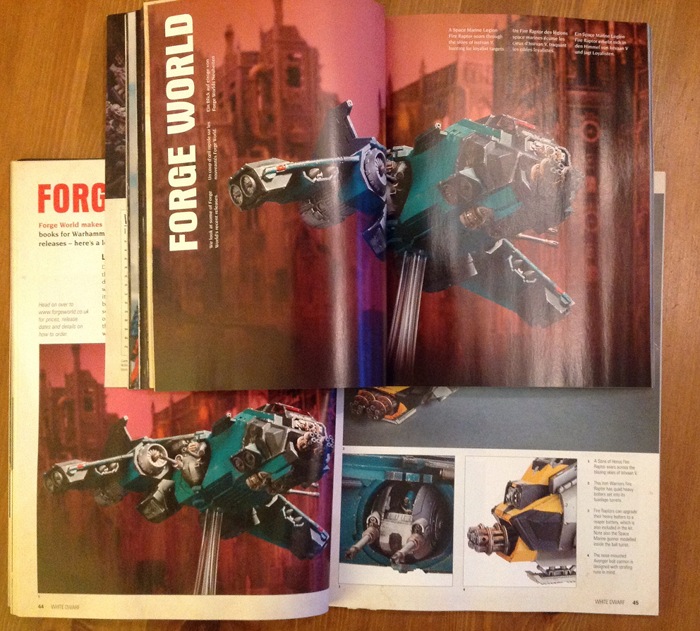
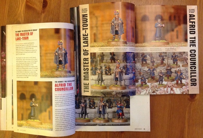
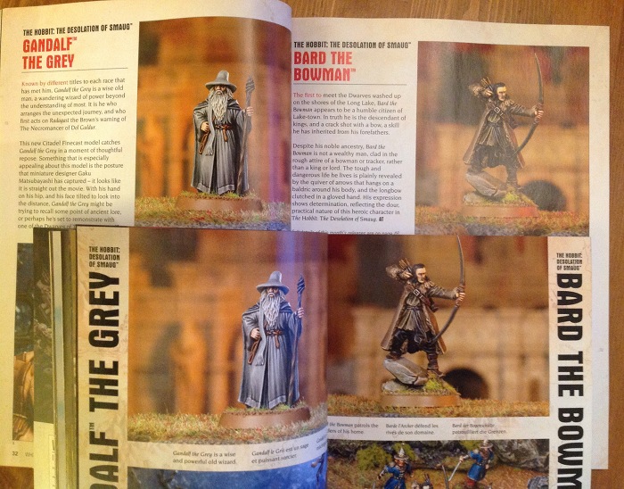
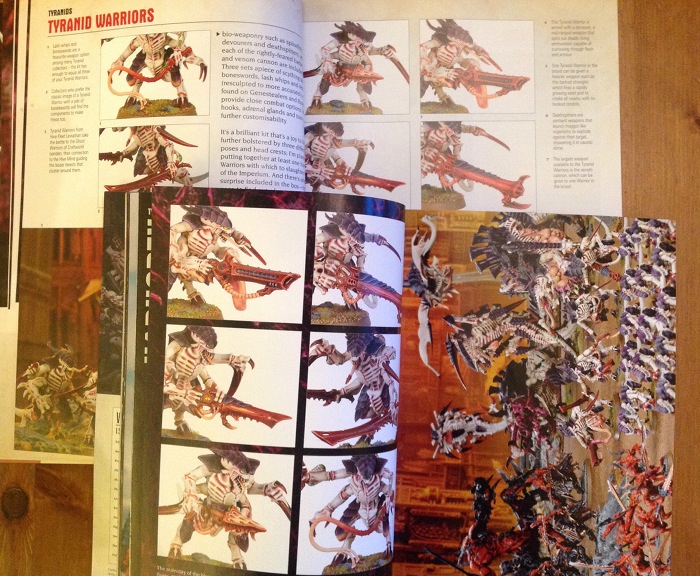
Many, many photos of Citadel miniatures. As advertised.
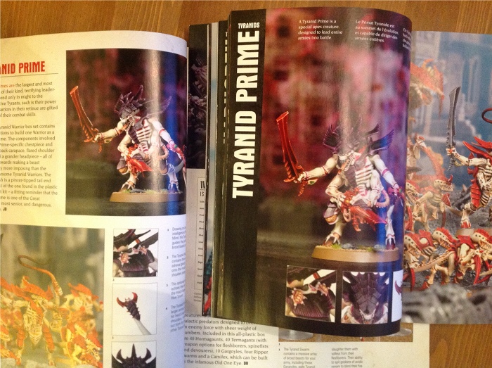
There is a Paint Spatter article that shows the different colours of the various Tyranid hive swarms. No discussion, no tips, just a list of colours to use and a picture of a bit of the model with it on.
There is a Blanchitsu showing the Inquisitorial warband of Jakob Nielsen in 9 pictures. I’m guessing it’s the same Jakob Nielsen that worked as an ‘Eavy Metal painter when I was at GW. Have a look at his site if you want to see a few hundred nice pictures of his other, equally nice work.
A showcase of Golden Demon entries from the Memphis incarnation of the competition promised to be more worthwhile. There are, indeed, a few very nice pieces here. Unfortunately they are rather spoiled by the overdone page design. Really nice models don’t need fancy backgrounds to show them off, and in this case the textured and splattered backgrounds made deciphering the equally textured and spattered tanks, etc more difficult. When the whole page is a distressed texture then the actual model you’re supposed to be looking at gets a bit lost. These two pics below have been left large so you can see what I mean. The page texture encroaches past the black keyline round the edge of the photo. Does it go over the model itself and confuse what you’re looking at? I don’t know. Am I looking at clever painting techniques or some paint/layout hybrid? I don’t know.

 Would have been much better with a simple, white background. This looks like someone ate the “visual feast” and was visually sick.
Incidentally, if you’re interested in pretty pictures of old GD winners, have a look here.
It took me a moment to realise what it was, but there is a battle report, after a fashion. It’s not called that, but this seems to be the last vestige of the old tradition. Turn to page 138 and you have a series of pictures which are laid out like a batrep, with each army on its own then a series of pictures ostensibly showing a battle. None of the “in-battle” shots look very convincing, and when it comes to the proud declaration of a Chaos Space Marine VICTORY at the end I was unmoved. No story, no tactics, no real point I could see other than an excuse for some more photos – but you don’t need an excuse when that’s all you’ve set out to do. Suddenly adding a few shots at the end of people standing around a table, pretending to game for the camera, does not make a battle report. But like I said, they never said it was. Cunning, eh?
The Kit Bash article takes a number of different modellers’ interpretations of Ork trukks, and the theme is a fun one. It could have been a really good article. Could have been. Sadly, the captions simply list which kits have been raided for bits or tell you the obvious “Will has moved the driver to the front…”. Well, yes, I can see that from the photos. Why don’t you give me some practical modelling tips? There’s plenty you could talk about in all of these models.
Of course, let’s not forget 10 pages of shop addresses.
Now the photos are technically good. The models are mostly the GW Studio ones which are painted by professionals who do nothing else. So they’re good too. However, we’ve seen some of them before. If you’re got the Tyranid codex there may be repeats there, and I’m sure some will also be online. However, as all I had was the previous WD and the new Warhammer Visions I only compared those two. The following is not a complete set of repeats, it’s just what I found in the first 5 minutes.
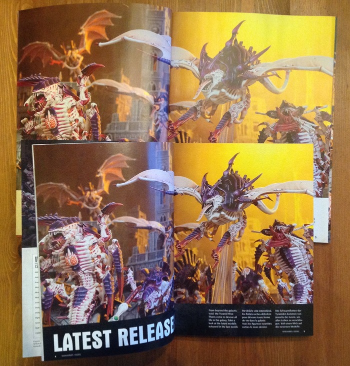


Whilst some reuse of pictures is understandable, there does seem to be rather a lot here. Remember also that the above examples are of the same photo being reused. Many of the other photos show exactly the same models from very similar angles.
Of course, if you want to see the models from all angles, many of them have 360 rotations on the GW online shop…
Thoughts
For me, Warhammer Visions is useless. I can see pictures of the models online whenever I want to for free. On GW’s own site, among many other places. In fact, on their site I can see exactly these same photos in some instances and certainly the same models in these same paint jobs.
What little text there is might as well not be there as it says nothing.
So who is it for? Well, if you’re a dyed-in-the-wool GW fanboy who simply wants to drool over some photos then you’ll love it. If you can’t speak a language that GW releases product in, but like the idea, then great. I can’t see that being a huge market though. Who else? Well I spoke to some of the GW staff at length, and one of them suggested that it was great for “small kids who just like flicking through”. I suppose he knows his market.
I didn’t mention the price point before, but it’s worth talking about. Warhammer Visions costs £7.50, which (my newsagent friend tells me) is the sort of price that one-off specials and so on might come in at, but not usually monthlies. At least, not monthlies that don’t have CDs and such included. That pretty much tallies with a morning’s worth of looking at magazine racks. It’s a pricey magazine.
Speaking of cost, what with GW reducing their costs over the last few years, why would they add a load more products to upkeep? Well I’ve been thinking about that. To be honest, the first thought I had after flicking through Warhammer Visions was that it would be a doddle to do. It’s photos in boxes, repeat. Very, very easy in terms of layout. The time here is in taking all the photos, but as we’ve seen they were ransacking archives in many cases. So the additional workload of this is actually rather small. The weekly looks like much more work. Without treading on my own toes (proper review of the new WD tomorrow) it’s effectively a quarter of the old WD. Four times that a month, plus Warhammer Visions equals much the same workload. I’m sure that’s what management told them. So no need for lots of extra pesky staff costs, and you magically make 5 magazines to sell with the same staff that used to make only 1. Genius!
Land Of Confusion
GW usually do things for sound reasons (in their view), even if I don’t necessarily like or agree with them. That’s fine. Here though, I’m struggling to see who this is for. I mean, when I flick through Trout Juggling Weekly in the shop, or carefully consider the latest issue of Yodelling International, I can easily see that there’s a market for them. But this?
Even in my most rabidly enthusiastic days (and I was something of a GW fan), I can’t imagine buying this more than once.

My best guess as to the reason why GW decided to release this vapid waste of space is in two parts. First, removing WD from the newsstand leaves GW with a marketing void. Second, and as you said, WV fills that void without needing to commit resources to a second magazine.
Heaven forbid that GW should actually invest in releasing a magazine that sells itself on providing useful, interesting and innovative hobby content. Even Jarvis’s Standard Bearer columns, which I used to enjoy, have increasingly become little more than rallying cries for little more than the expenditure of money on products whose intrinsic value, let’s face it, exists only in our imaginations.
They’re selling what used to be the good content of WD for up to £8.99 an article as digital downloads, that’s why the content you desire isn’t in print any more 😉
I think this is at the core of the problem. GW sells painting guides, model terrain, etc so why give away that info for less and tell folk how to make their own buildings? I think that’s a flawed argument, but I can easily imagine them making it.
Where is the “like” button for the above comment. 😉 When GW ramped up their digital offerings with Belakor ($3.99 iirc) through Cypher (which iirc, was more than $10?), over the holidays, I knew that any hope of useful articles appearing in WD were dead and buried. The only GW games I play are from the Specialist Games line, so none of this affects me in the least, but I still find it annoying. Charging more than the cover price of an issue of WD for what once would have been a single article included among many others? Lunacy. Kudos to GW for pulling one over on the customers yet again. Sorry; it’s just so hard not to vent steam when thinking about it. I’m glad I’ve kept all my old issues from the halcyon days of yore, which for me started around the 180s or so. When all you play is their old stuff, those old issues still have value. 😉
I’m glad to hear you’re still getting value out of the old issues. I’m looking forward to going into the archives for a look at some of the old issues to see how much is nostalgia and how much real difference.
Talarius – I know what you mean – I often flick back through my old white dwarfs to look at the epic stuff. I’m not sure how much of it is just nostalgia on my part though…
Jake – if you do intend on looking back, may I humbly suggest 188? This might make for an interesting comparison with this months warhammer:visions, since this is the issue that tyranids were released in 2nd ed 40k. The fact that it contains my favourite battle report is merely coincidence!
Suggest away!
I like the idea of comparing the release issues for different generations of the same codex. Good call!
Well, at least in the guise of Warhammer Visions the WD is dead. That´s some lifestyle pamphlet but nothing I would shell out 9 Euros for.
WD sadly is not better, it is like some Novel Cuisine. Looks interesting, but leaves you hungry after you consumed it.
I’ve met a *lot* of people over the years who don’t own models, don’t play games, don’t paint figures… yet they buy White Dwarf every month. Warhammer Visions is for them; miniatures porn for people who can’t use Google.
Really? Can’t say I know anyone who buys WD and has no figures. Still, I haven’t met everyone 😉
Oddly enough, when I went to university I stopped playing wargames and did no hobby for about 8 years. However I kept buying White Dwarf every month… That said, I don’t think visions would have appealed more than old White Dwarf.
I have had the same experience but then buying WD was a way to stay in touch with a hobby I no longer had time for. Visions can not fill that role.
Vision’s audience is kids/teens. they’ll drool over these pictures that will feed their overactive imaginations, then cut them out and hang them up in their rooms as an indirect way of telling mom and dad that this is what would make a great birthday or christmas gift…
Now that’s a good use – a sort of visual Santa list.
Pingback: A pretty good review of the new WD. | This Blog Only Has Power Armor Innit.
Pingback: Reviews of Warhammer: Visions and White Dwarf | Scent of a Gamer
Pardon my language but the repeats between WD and WC is *#@%&£g scandalous!
When I read Jakob Nielsen yo had me asking myself WTF – since when was JN a wargamer? The Jakob Nielsen I know of is revered in the web and interface design and user experience (UI/UX) as a usability guru (www.useit.com)? Who knows, maybe GW could use his help!