White Dwarf Reborn – Part 5

line


So there you have it: a Brave New World of weekly Dwarfs and a “visual feast” once a month in case you missed anything. After looking at the old Dwarf, the new incarnation and the Warhammer Visions that replaces the old Dwarf on the newsstands, what do I think overall?

Well, it’s a bit of a mixed bag and, I would argue, a missed opportunity.


Good Things

The best thing is the new life that White Dwarf seems to have found. It’s a tone thing rather than a specific page reference, but it’s crucial in making something worth reading. Perhaps it’s the excitement of the change, perhaps it’s the impending panic of wondering how they’re going to do this every week – I don’t know. Whatever the cause, I thought that the last of the monthlies was half asleep, and the first weekly had woken up fresh and cheery after a long rest. Long may that continue.

The weekly format also had a lot less chaff in it, though it could still prune back just a little more. Even though it’s short, at least most of it is actual content (and yes, I do count the promo stuff at the front as content – WD is all advert so why be picky?).


Not So Good Things

There are two main things:

  1. Warhammer Visions.
  2. Restricted WD distribution.

Warhammer Visions, hmmm…. Collectable? Yes, but only in the sense that my local council collects my waste paper every fortnight for recycling.

All the good things about the new WD are lost because they have gone from something that could be sold in every newsagent and every supermarket in the country to only being available in their own stores and a few approved stockists (I’m talking physical copies here, not digital). I don’t know the exact difference in numbers, but it’s got to be pretty big. This means that the best of the new changes is hidden away. If you don’t go into their store every week then you’ve missed it. As has been mentioned in comments on the earlier parts of this article, that doesn’t generally encourage customers to go to your store, it drives them to the competition or out of the hobby altogether. It will be worth watching to see if WD creeps back into wider distribution in a few months.


Conclusion

Whether this makes more money for GW or drags more customers into their stores doesn’t really make much difference to me. I started this series wanting to know if these magazines would be a more or less interesting read after the change, I think that it’s pretty clear.

The new WD has regained some of its verve, which is good. If it was easily accessible then I would probably buy at least some of them. Perhaps not every issue, but I’d add it to the ones I looked at. As it isn’t they’ve shot themselves in the foot as I’m a long way from the only one who won’t be bothered to make a special trip to get it.

I’m trying very hard to be polite about Warhammer Visions. It is a strain.

As far as I can see, leaving WV as the only thing on the shelves of newsagents and supermarkets (ie making this the most widely available GW promo item) seems like a very Bad Thing to me. Certainly I won’t be wasting any more money on it myself.

Luckily, there are many other magazines to look at. We, as gamers, are not stuck for choice. If you can see outside the narrow confines of Games Workshop’s games then there are many, many options for painting, modelling and gaming advice and reading. I’ll be looking at some more of these over the coming weeks and I, for one, find the excuse to trawl through them all in detail quite exciting 😉

Posted in Review | 32 Comments

White Dwarf Reborn – Part 4

line

Next we come to the reincarnated White Dwarf itself. It’s a fitting cover. Interesting that they’ve gone to issue 1.

Weekly WD 4Let’s start with a look at that mission statement from GW (on the wrapper of Warhammer Visions):

GW intent

This time, ignore the top bit. So WD is “all that’s new and exciting in the hobby”. Well breaking that down, “in the hobby” is redundant as they never talk about anything else, and “exciting” is also irrelevant as they’re obviously going to think that. They would never admit to talking about something “new and dull in the hobby”, would they? That leaves us with “all that’s new”. OK, that’s simple: the subject is new stuff this week. The detail below is more exciting to me: “painting guides, modelling articles… gaming commentary.” That might be worth reading.

The editorial says much the same thing with more hyperbole.

Format

Physically, this is the same page size it was before, but less pages (32). This slender form has caused a change in binding (it’s gone to “saddle stitched” – stapled as you might call it). This does mean that it actually lies flat when you open it, which would have been nice for a picture book like, say, Warhammer Visions. Hey ho.

Gone is the swanky spot varnish on the cover (cheaper and easier not to have it). Still, the cover is nice and looks indistinguishable from the previous WD style. As always, the print quality is excellent.

As there is so little change apart from technicalities and size, there isn’t much to discuss. It’s obviously smaller as they are releasing it 4.3 times as often, so there’s no mystery there.

Content

How do they do then? Hyperbole and marketing blurb aside, what do they squeeze into the new Dwarf?

The main focus this week is the new Dwarfs. Each of the new releases gets 1-3 pages of pictures and background. These are nicely done mixtures of background, photos of close ups of various details on the new models, and occasional personal commentary on favourite bits. The text seems reasonable for a brief piece of this kind. If you are seeing the Dwarf models for the first time, or are looking at them anew in the light of the new toys, then it does its job. The photos are good too. Although they aren’t specifically about painting there are some lovely crisp close ups that show some interesting detail. The reddened nose on the Slayer is particularly nicely done.

The one thing I find missing is pictures of the sprues themselves. However, that would give a different vibe to the thing which is of top notch painting and shiny presentation. It is, after all, an advert, so fair enough.

Weekly WD 3We then have some Black Library stuff and a mention of Warhammer Visions. Not of interest to me, but again, fair enough. GW seem to make quite a bit of cash off the novels, and so it’s only sensible to push them.

Next up we have Jervis, and he’s got a little mini game to play. This is an alternative to rolling to see who goes first in a battle and is a great idea. The game itself is a variation of a classic push-your-luck dice mechanic and seems to work fine. Personally I found the game itself a little underwhelming and I didn’t like that it was entirely abstract and unrelated to the armies in play. I do like the general idea though, and it’s something I’ve been working on for God of Battles as part of the campaign rules we trialled a few months ago. Again, as Jervis and I are of a similar vintage we’ve both seen this before. Giving it a shiny polish for a new generation is a great idea. A practical mini game in a White Dwarf: that’s a good thing.

After that there is a talk about how the new Tyranid codex has changed the army and what that means for Nid players (and their enemies). Now I don’t play 40K, but even so the article was an engaging enough read. They asked the views of several different players and I thought that worked well to give a rounded view of the new codex. Whether they’re right or not I couldn’t say. What I can say is that it felt like they were enthused and engaged themselves. I didn’t get that feeling from the last monthly issue.

The Paint Splatter article was a perfect illustration of why you need commentary as well as paint swatches. The personal comments from the painter weren’t the most insightful thing I have ever read on the topic. Having said that, what it did do well was tell a story and make you want to look at the pictures as illustration of that story. It gives the article a framework that makes sense which the Warhammer Visions Paint Splatter article sorely lacked. There I get some pictures. Here I get an explanation of why he chose the colours he did and, equally importantly and impossible to show in the WV format, what he did not use and why. A handy little painting article.

Weekly WD 5Following on from the painting is a little article about plastic glue. This is a little gem of  a piece. Often this sort of mundane hobby detail is lost among the shiny new toys and it is  actually really important. Before you can do the fancy stuff, you need to understand the basics.

We then have the rules for the Dwarf character Belegar and some commentary and designer’s notes on him and the regiments. Again. I thought this was well put together.

At the end we have a few pages of snippets. These include a rather lame customer’s letter (actually, it’s the answer that’s a bit lame), a reader’s model, a how to paint stripy trousers, plus some random factoids from the Warhammer universes. The best bit is the nicely written Bluffer’s Guide to Dwarfs. It’s only half a page, and it didn’t tell me things I didn’t know, but it made me smile.

Thoughts

I find myself liking this mini Dwarf. It has a lot more charm than the previous (monthly) issue; a lot more life and excitement. Not, perhaps, as good as it was in days of yore, but that sort of thinking may all be nostalgic twaddle on my part. I need to go and check.

I thought that the only entirely unnecessary waste of paper were the two pages devoted to plugging Warhammer Visions.

Weekly WD 1Even though you’d have to be blind to miss the promo if you’re anywhere near the GW hobby, it’s new, and it’s a sister mag, so you’d expect White Dwarf give it a mention. But in as slight a volume as this, to dedicate two whole pages to near identical images (see above) and copy is just wasteful. It’s not like there are hundreds of pages to get lost in and miss it. In a volume this small every page counts, and there are plenty of more interesting things to do with that inside back cover.

Other than that I think this was a good effort. As a first issue in this new format this sets quiet a high bar to maintain, and that maintenance will be a challenge. Still, it’s not like they didn’t know that when they started.

Is It For Me?

Well it’s clearly not aimed at me. I’m way too long in the tooth for much of this to be new, and I understand that. Despite this I find myself quite drawn to the new White Dwarf. It comes across to me as being quite a cheery place, and that’s the core of a fun hobby. If I was still steeped in GW I would be pretty happy with this as a magazine.

So would I buy it again? Actually, I might. I’m not too proud to say that I forget stuff and even the basics of painting and modelling are worth being reminded of and having reference for. I also spent over 25 years playing Warhammer. Even if I don’t play it now I have a residual fondness for the background and the story. So for the low price point I might be tempted.

What puts me off, and what makes it far less likely I will get it, is the simple fact that they have made it physically awkward. I could buy it digitally, but I don’t want a digital copy. Again, being long in the tooth I’m not of that generation. I like a real magazine in my hands. I do use digital copies of rules all the time for work, but not as my primary tool.

If I want a real copy then I’ve got to go two hours round trip out of my way and £3.50 extra to get it, on top of the cover price. Is it worth £5.90? Not to me. So because they won’t distribute this to my local newsagent or supermarket (who both carried the old monthly WD and now carry Warhammer Visions), I am stuck. Well I won’t weep too long. There are plenty of other magazines I can get. Stay tuned for reviews of those.

At the end of the day though, this is partly what the new WD is for: to drive people into the stores. Are they worried that some, like me, are too out of the way for this to be practical on a weekly basis? I very much doubt it. For their core audience I can see this being a very clever move for GW and wish them well with it. If they can maintain this quality then GW fans should be happy.

line

Aside Number 1

Dwarfen? Is this a Tolkein thing? When I was in GW we would have been shot for using this word. He was a Dwarf King.

Aside Number 2

Stunning? Another word we had on the verboten list. Actually, stunning was streng verboten and underlined twice for emphasis. The only instance we were allowed to even consider using it was to refer to the properties of a large, heavy object that had been rapidly brought down on someone’s head. That was stunning. Everything else wasn’t.

Aside Number 3

When did Dwarfs get so tall? The short folk seem to have undergone another change in physique with this wave of releases. It’s not necessarily good or bad, it’s just a change. One of my first armies (I started with 2 at once) were the Dwarfs, so I’ve always had a soft spot for them and kept a weather eye on how they looked. The leaping Slayer is the extreme end of this new dynamism, but for scale it’s Belegar who looks most strikingly different to me. He actually looks tall. I wonder how big he really is.

Posted in Review | 21 Comments

White Dwarf Reborn – Part 3

line

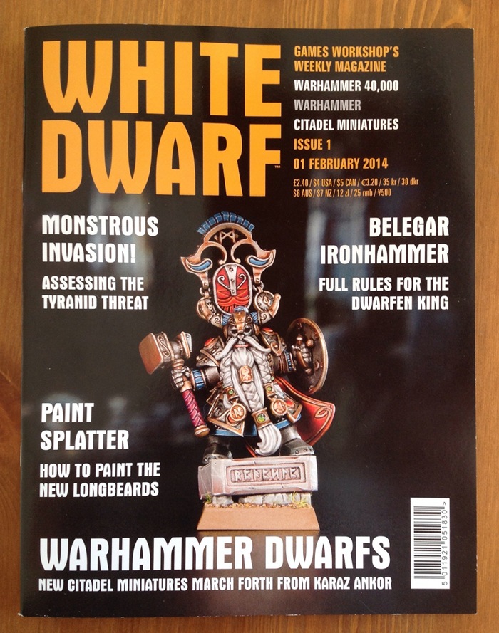
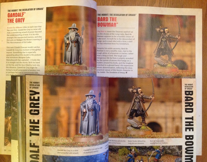
I was going to look at the new, svelte WD first, but I got Warhammer Visions yesterday and have changed my mind. I want to start with this:

W Visions

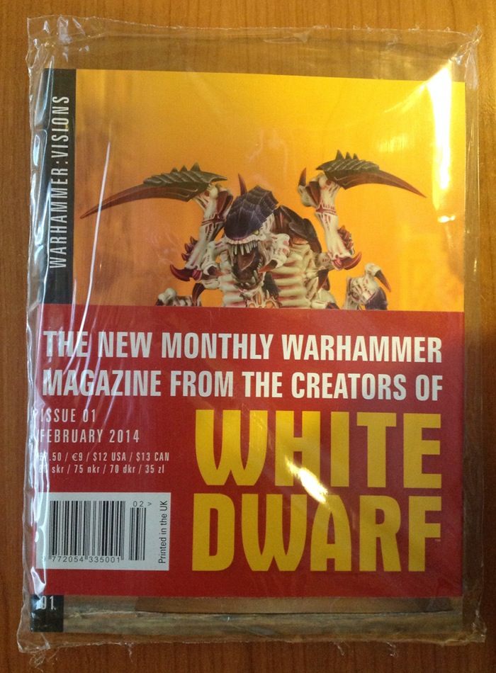
And here it is. This issue, at least, comes in a protective bag for some reason – perhaps to protect the paper wrap. The wrap is interesting mostly for the back which gives a sort of mission statement for both new magazines:

GW intent

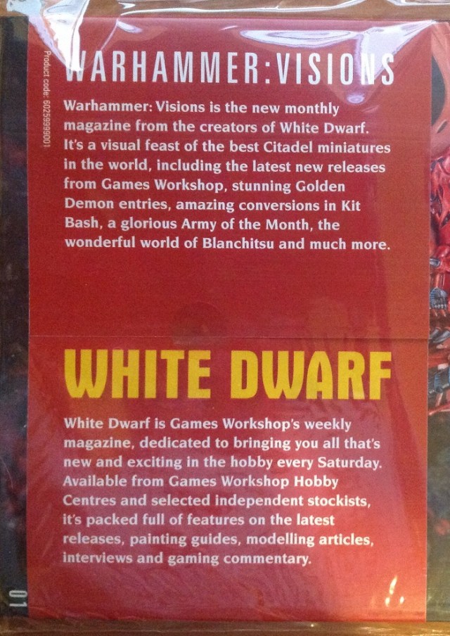
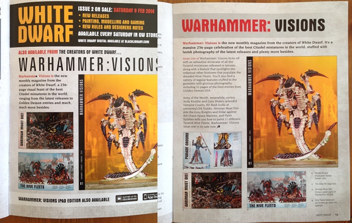
Ignore the bottom bit for the moment and focus on the top half. Warhammer Visions is a described primarily as a “visual feast”. Opening the mag itself has another bit about Wahammer Visions on the inside cover. This says much the same thing as above in different words, calling it a “photographic showcase”. So the aim is pretty clear: it’s eye candy. Fair enough. How’s it do on that?

Format

For some reason, Warhammer Visions is a smaller page size than the old WD. It’s slightly wider than A5 and a couple of mm taller (215mm x 165mm). WD was already smaller than most magazines, perhaps because of its name. The small page size of Visions is married to a large page count (228 pages + covers), so you end up with a short, fat book. They really should have called this White Dwarf…

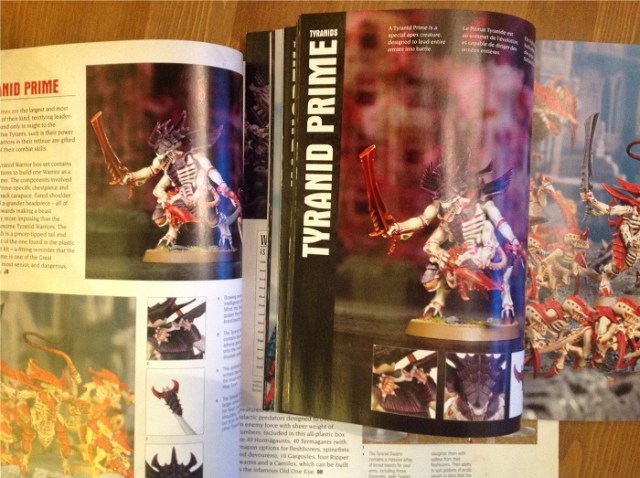
The cover again has spot varnish on the Nid, and the print quality is, again, top notch. The paper could be nicer.

There is very little text in the mag. This article has several times more text than the whole 230+ pages of Warhammer Visions. What little text there is comes in 3 languages: English, French and German. To be honest, I’m not sure why they bothered. There is so little of value in the tiny captions that they could have been left out entirely. That way they have a totally language free magazine they can sell anywhere.

Going back to the size, it’s an odd one. The only bonus I can see is that it’s more easily portable. Mostly it seems like a poor choice for a magazine dedicated to showing off pretty pictures. Think of normal art or photography books (the obvious archetype of eye candy volumes) and what do you imagine? I think of large format coffee table books; certainly the tendency is towards more space to show everything in more detail and to have lots of shining white to surround and offset the elegantly taken shots. And yes, I did go to art college as well. Look at the shelves in your local bookstore. If it’s anything like the ones round here then one of the few sections where the books mostly stick over the edge of the shelves is the art and photography section.

So, why go smaller?

Another thing that is worse for this diddy size is the gutter. In print terminology, the gutter is the middle of the book, by the spine, when you open it. This is where the bend of the book is worst and where any picture unhappy enough to fall in is lost to distortion. The “perfect binding” (another technical term) used here makes the magazine impossible to lie flat when its open, so it exacerbates the issue caused by a fat volume. This isn’t the way to show off the pictures at their best. Overall, if you’re trying to make something that is all about looks then you certainly wouldn’t pick a small, fat, perfect bound volume to do it in.

So, why go smaller?

Is it simply to make a point of obvious difference between the two? I don’t know. They could always have gone bigger. That would have made more sense visually. The least charitable reason I’ve heard so far is that it’s a better fit for the small hands of the eight-year olds it’s aimed at. More on that later.

Content

Lots of pictures.

No, Really, What’s In The Mag?

OK, in more detail.

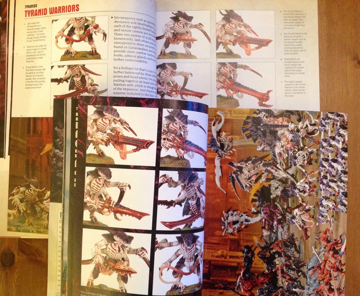
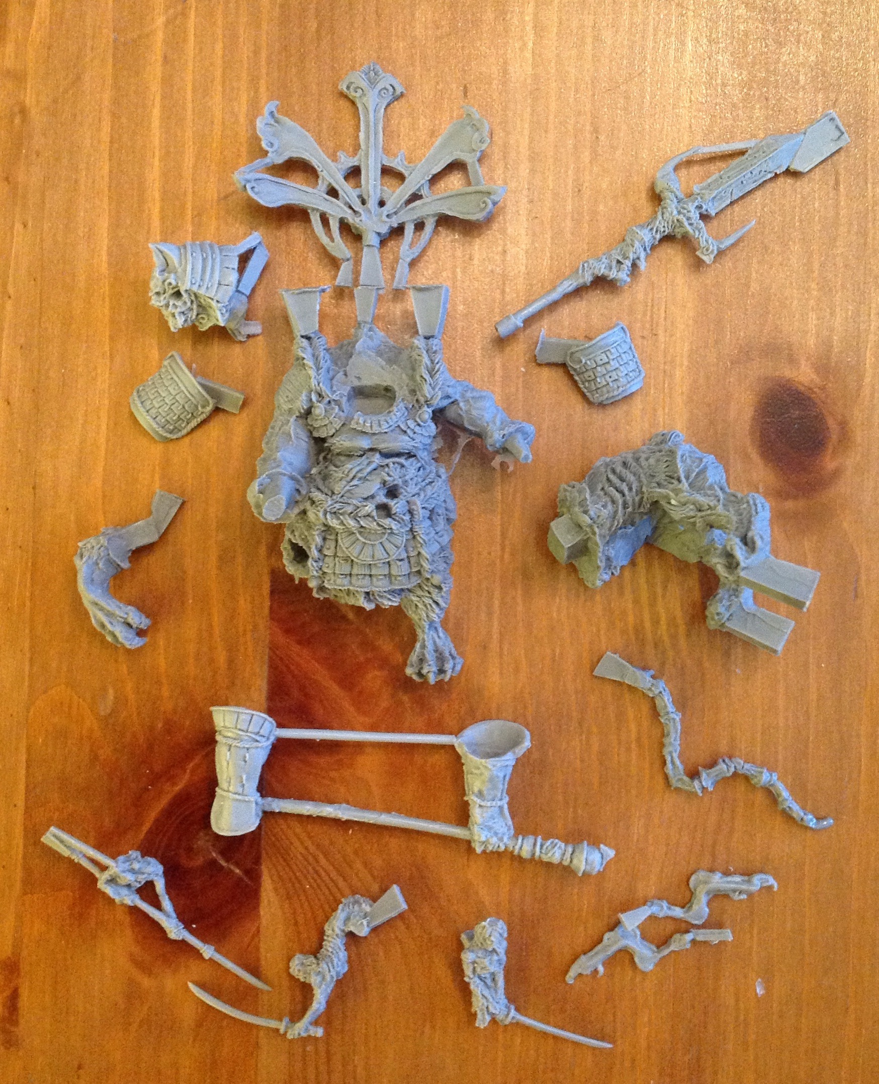
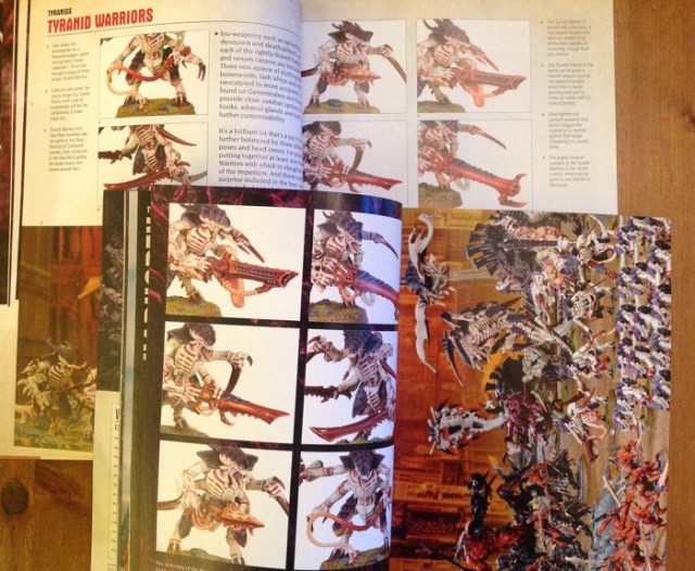
Many, many photos of Citadel miniatures. As advertised.

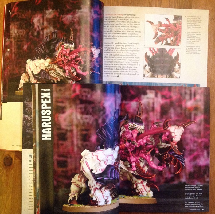
There is a Paint Spatter article that shows the different colours of the various Tyranid hive swarms. No discussion, no tips, just a list of colours to use and a picture of a bit of the model with it on.

There is a Blanchitsu showing the Inquisitorial warband of Jakob Nielsen in 9 pictures. I’m guessing it’s the same Jakob Nielsen that worked as an ‘Eavy Metal painter when I was at GW. Have a look at his site if you want to see a few hundred nice pictures of his other, equally nice work.

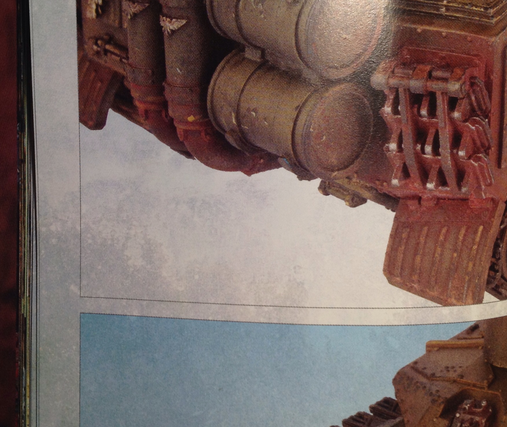
A showcase of Golden Demon entries from the Memphis incarnation of the competition promised to be more worthwhile. There are, indeed, a few very nice pieces here.  Unfortunately they are rather spoiled by the overdone page design. Really nice models don’t need fancy backgrounds to show them off, and in this case the textured and splattered backgrounds made deciphering the equally textured and spattered tanks, etc more difficult. When the whole page is a distressed texture then the actual model you’re supposed to be looking at gets a bit lost. These two pics below have been left large so you can see what I mean. The page texture encroaches past the black keyline round the edge of the photo. Does it go over the model itself and confuse what you’re looking at? I don’t know. Am I looking at clever painting techniques or some paint/layout hybrid? I don’t know.

Textured page 1 Textured page 2Would have been much better with a simple, white background. This looks like someone ate the “visual feast” and was visually sick.

Incidentally, if you’re interested in pretty pictures of old GD winners, have a look here.

It took me a moment to realise what it was, but there is a battle report, after a fashion. It’s not called that, but this seems to be the last vestige of the old tradition. Turn to page 138 and you have a series of pictures which are laid out like a batrep, with each army on its own then a series of pictures ostensibly showing a battle. None of the “in-battle” shots look very convincing, and when it comes to the proud declaration of a Chaos Space Marine VICTORY at the end I was unmoved. No story, no tactics, no real point I could see other than an excuse for some more photos – but you don’t need an excuse when that’s all you’ve set out to do. Suddenly adding a few shots at the end of people standing around a table, pretending to game for the camera, does not make a battle report. But like I said, they never said it was. Cunning, eh?

The Kit Bash article takes a number of different modellers’ interpretations of Ork trukks, and the theme is a fun one. It could have been a really good article. Could have been. Sadly, the captions simply list which kits have been raided for bits or tell you the obvious “Will has moved the driver to the front…”. Well, yes, I can see that from the photos. Why don’t you give me some practical modelling tips? There’s plenty you could talk about in all of these models.

Of course, let’s not forget 10 pages of shop addresses.

Now the photos are technically good. The models are mostly the GW Studio ones which are painted by professionals who do nothing else. So they’re good too. However, we’ve seen some of them before. If you’re got the Tyranid codex there may be repeats there, and I’m sure some will also be online. However, as all I had was the previous WD and the new Warhammer Visions I only compared those two. The following is not a complete set of repeats, it’s just what I found in the first 5 minutes.

Reused 5 Reused 6 Reused 7 Reused 1 Reused 2 Reused 3 Reused 4 Reused 8 Reused 9

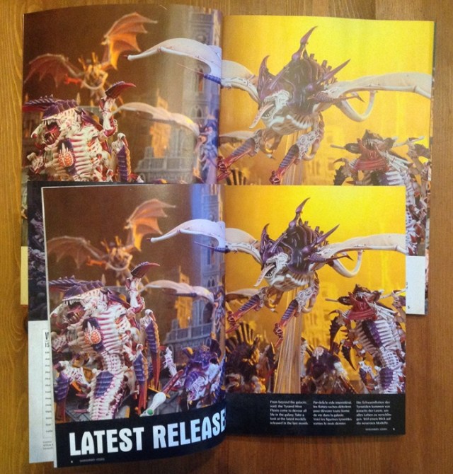
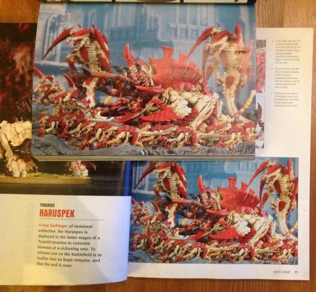
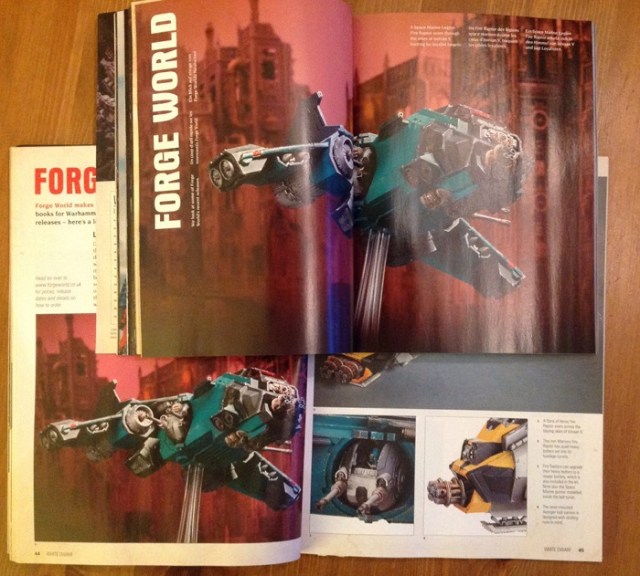
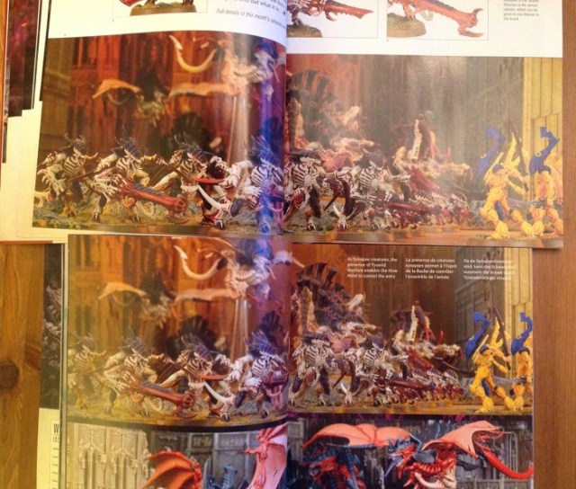
Whilst some reuse of pictures is understandable, there does seem to be rather a lot here. Remember also that the above examples are of the same photo being reused. Many of the other photos show exactly the same models from very similar angles.

Of course, if you want to see the models from all angles, many of them have 360 rotations on the GW online shop…

Thoughts

For me, Warhammer Visions is useless. I can see pictures of the models online whenever I want to for free. On GW’s own site, among many other places. In fact, on their site I can see exactly these same photos in some instances and certainly the same models in these same paint jobs.

What little text there is might as well not be there as it says nothing.

So who is it for? Well, if you’re a dyed-in-the-wool GW fanboy who simply wants to drool over some photos then you’ll love it. If you can’t speak a language that GW releases product in, but like the idea, then great. I can’t see that being a huge market though. Who else? Well I spoke to some of the GW staff at length, and one of them suggested that it was great for “small kids who just like flicking through”. I suppose he knows his market.

I didn’t mention the price point before, but it’s worth talking about. Warhammer Visions costs £7.50, which (my newsagent friend tells me) is the sort of price that one-off specials and so on might come in at, but not usually monthlies. At least, not monthlies that don’t have CDs and such included. That pretty much tallies with a morning’s worth of looking at magazine racks. It’s a pricey magazine.

Speaking of cost, what with GW reducing their costs over the last few years, why would they add a load more products to upkeep? Well I’ve been thinking about that. To be honest, the first thought I had after flicking through Warhammer Visions was that it would be a doddle to do. It’s photos in boxes, repeat. Very, very easy in terms of layout. The time here is in taking all the photos, but as we’ve seen they were ransacking archives in many cases. So the additional workload of this is actually rather small. The weekly looks like much more work. Without treading on my own toes (proper review of the new WD tomorrow) it’s effectively a quarter of the old WD. Four times that a month, plus Warhammer Visions equals much the same workload. I’m sure that’s what management told them. So no need for lots of extra pesky staff costs, and you magically make 5 magazines to sell with the same staff that used to make only 1. Genius!

Land Of Confusion

GW usually do things for sound reasons (in their view), even if I don’t necessarily like or agree with them. That’s fine. Here though, I’m struggling to see who this is for. I mean, when I flick through Trout Juggling Weekly in the shop, or carefully consider the latest issue of Yodelling International, I can easily see that there’s a market for them. But this?

Even in my most rabidly enthusiastic days (and I was something of a GW fan), I can’t imagine buying this more than once.

Posted in Review | 19 Comments

Lots To Read

Well that was interesting.

As the new WD isn’t available anywhere I can walk to, I’ve been in town all morning. However, as I was there I thought I’d pick up some other magazines that aren’t available locally and have been browsing through the shelves of several different stores. Here is the haul:

photo-9

I got Warhammer Visions yesterday and read that on the tram ride in. I read the new WD on the way back. Reviews of those coming up, probably Visions first.

Now that I’ve started talking about magazines I think I’ll do a load more reviews once I’ve finished with GW’s efforts. There are a lot of great gaming and modelling magazines out there and so it might be fun to explore a few.

While I’m in the mood to hoover things up, are there any mags you think I should look at? Print or digital, either is fine.

Posted in Random Thoughts, Review | 22 Comments

White Dwarf Reborn – Part 2

line

As I said in the previous post, I wanted to start by looking at the last of the monthly versions of WD to see what that was like. A benchmark, if you will.

WD Nid

Here we are: January 2014, Tyranid issue. Like most issues of WD this is heavily themed with the major release of the period it covers. But what is there that I can take away from this if I’m not a Nid player? What if I don’t play anything from GW? Are there any interesting tactical ideas, thoughts on campaigns, painting or modelling tips?

Well I’ve now read as much as I can cope with. I looked at lots of pictures and admired the rather nice printing. Spot varnish on the cover and good fit throughout on the printing, so technically pretty enough.

Not So Good

Inside it’s a big shopping list till page 50. Nothing in there for me. 40K players can bask in the Hive Mind’s wonders, but there’s no tips, just a showcase of new toys to buy. That’s fine. This is, after all, what WD is mainly for.

Eight pages of Army of the Month tells me nothing useful or non-obvious. Armies on Parade were no different from those I’ve seen hundreds of times before (I’ve judged painting comps at several GW tourneys and looked at a great many armies in my time).

The battle report was very disappointing. It doesn’t seem to have changed format since before I worked on the mag, and this wasn’t a desperately engaging account either. I used to read battle reports even when I didn’t play the game in question because they were often just good reads (and I’m a geek). They have a nice idea of mini objectives and rewards, etc, but overall it’s just a bit flat.

Eleven pages of shop listings, plus many other pages of “what’s on” adverts are the absolute nadir of this issue. I’ve long thought these a waste of space.

So no real surprises so far. Lots of stuff that is of no real interest to me.

Not So Bad

I’m stretching here.

Jeremy Vetock’s ramble about hobbies was amusing for 5 minutes. It reads very much like a blog post. OK for a tea break.

Paint Spatter had some useful pics of what each layer of paint does to change the model. I don’t want to paint those specific models, but this reference could, potentially save me a test model. The techniques themselves are all standard stuff.

The highlights for me were Jerv’s article and Blanchitsu. I am, however, of a similar vintage to Jerv and have had plenty of similar conversations with him over the years. This, therefore, is amusing, but nothing I don’t know already. It does seem to be the only thing for Warhammer players though. 

Blanchitsu was far, far better than the Kit Bash article with loads more of interest in half the pages. It showcased the only different painting in the whole issue, which was possibly why I found it so interesting. Variety being the spice of life and whatnot. A moment’s Google and you find that the featured chap is a professional illustrator, so it’s not surprising that he’s a bit useful with a brush. 

All Told

Not worth it for me.

To be honest, if I was a Warhammer player (as I mainly was) then I don’t think it would have been worth it either. In fact, if I wasn’t a Tyranid player I’d have struggled to find much to get excited about in this issue. As it stands, there is zero of interest in terms of tactical thoughts, and the only moderately interesting painting bits are neither new nor telling me anything I can’t find done just as well (or better) for free, in more detail and better explained on the net: Romain’s painting videos on BOW, the massive gallery at CMON, WAMP painting forums, and so on. There is a massive amount online.

Actually, thinking about it, there is nothing in this issue that I can imagine opening the covers for again. This in stark contrast to many other gaming and modelling mags.

Am I surprised or dismayed? No, not really. I’m nowhere near their core audience. Still, I doubt I’m the core audience for AFV modeller either, but…

So, if this is the benchmark, then different can only be better. Right?

Posted in Review | 26 Comments

White Dwarf Reborn – Part 1

line

I’m sure that most of you will have seen, heard or otherwise assimilated the news that Games Workshop’s famous White Dwarf magazine is undergoing some drastic changes, starting tomorrow.

Let us assume for a moment that this change in format presages Global Calamity, the fabled End Time, Ragnarok, Armageddon and so on. Go on, wail, gnash your teeth, cry out and rail at the skies with impotent fury (always a favourite). When you’ve got that out of your system I’ll carry on.

No need to rush. Vent that spleen (just not in the comments, please). I’ll wait.

Intermission

Now that everyone has calmed down, let me explain why I’m interested. I don’t play any GW games and haven’t for a while. And no, I’m not going to count Dreadfleet. I do, however, have an interest in gaming in a wider sense and still play many figure games. This means that I’m interested in painting and modelling as well as tactics articles and what-have-you. Every month I buy a few magazines on similar topics (which I really should review as there are some excellent ones). Would the new WD/Visions be something worth adding to that mix?

I also spent five years working on the White Dwarf itself, back in the day, so I have a sort of professional curiosity to see what they’re up to with the old chap. Are they helping the old duffer across the road, or pushing him under a bus?

These interests leave me with a slightly different outlook on the whole change to many bloggers. To start with, I’m not reading WD these days anyway and haven’t for years. This means that I’m not losing anything if it is rubbish. Instead I’m thinking of this change as  an opportunity for GW to do something cool and interesting. They have a chance here to produce something that will appeal to a wider audience than their own limited fan base. Large as it is, there is more to the world of gaming, painting and modelling with toy soldiers than GW, and there is no reason why they couldn’t appeal to that audience as well – even if the products and models they use will invariably be their own. Because let’s face it, GW make some perfectly acceptable models, paints and so on. They may or may not be the best, and they are certainly not the cheapest, but they do have a range that covers most of the bases in terms of tools. They also have a large number of extremely talented sculptors, artists, painters and so on working for them. Why not leverage that into a wider audience? Who knows, you might even spread the GW brand wider, win some converts, and sell a few pots of paint?

So, where do we begin?

In case you’ve missed out, this change is quite simple to explain in principle. To start with, White Dwarf goes weekly and drops from its current size to a slender 36 pages. Quite the diet. In addition, a new magazine appears called Warhammer Visions. This is a 230+ page monthly (though some of the page area is lost by going to a smaller format – see the picture below from GW’s site).

WD splitsI thought that I’d look at these new magazines one at a time when they were released (officially tomorrow). But to start with it seemed worth writing this intro to try and defuse a little of the inevitable fury that appears whenever anything GW is discussed online. I also thought that it made sense to look properly at White Dwarf before this change as a reference point – something I haven’t done in some years.

The plan, then, is this:

  • Intro (you’re reading it).
  • Review of the last monthly WD
  • Review of new WD
  • Review of the new Warhammer Visions
  • Conclusion

I want to break this up in order to focus on each bit separately. Some articles will doubtless be longer than others. There will certainly be digressions along the way. However, my main interest here is not whether it is a better or worse magazine for fans of GW games (I don’t really care), or whether it is more expensive (which it will be if you buy them all), but whether it was/is a worthwhile magazine for a non-GW figure gamer.

We shall see.

Posted in Review | 36 Comments

We Can Kill Each Other After All

Looks like we’re go for slaughter at the usual venue, just a week later than our normal slot. Yes, it’s God of Battles at Foundry on saturday the 8th of Feb 🙂

Cue martial music and trash talk…

Posted in God of Battles | 4 Comments

Unboxing Darkhammer’s Bloodlust Tyrant

Bloodlust Tyrant artThe last of the three models I got from Darkhammer is the biggest and baddest: the Bloodlust Tyrant. Don’t let the fact that he abbreviates to BLT make you think he’s a dainty morsel: he’s a monster.

Yes, it’s more demonic undead naughtiness from Asia. Again, I’ve no idea whether this represents a specific mythical creature or whether it’s a more generic expression of the sculptor’s nightmares. Either way, it’s a great looking piece.

As with the Samurai and Monk, it comes well protected in a pass-the-parcel set of layers. Straight out of the bag it looks like this:

BLT 4

I’ve not cleaned, straightened or otherwise fixed anything.

As you can see, there’s quite a lot of parts in this box. Annoyingly I just realised that I haven’t added a scale to this, so you’ll have to use the parts of undead humans he’s decorated with as a guide (there’s three of them at the bottom of the pic above). He’s not small though.

As there is so much detail of armour, weapons, corpses and rotten, mangy, fur and flesh texture on this chap I’ve left these pictures a bit bigger than usual so you can click and enbiggen 🙂

As before, these remind me of some of the Rackham models in terms of detail and unpleasantness. And that’s a good thing. Rackham wasn’t perfect all the time, but it came  close more often than most. I really must dig out the Uraken Ogres to see how they’d sit alongside these chaps. They aren’t undead, but still…

Anyway, more pictures!

BLT 1

The main body from a slight angle. Lots to play with here.

The next two are me holding the two main body parts together. This isn’t glued so the join is OK, but not perfect. That’s possibly just the way I’m holding them. Again, no shortage of detail to drybrush, wash or otherwise pick out.

BLT 3

BLT 2

There are a couple of slight whitening scuff marks on the right hand side of the model. In person it looks like it’s simply discolouration rather than anything that needs repairing, so nothing to panic about. In any case, an undead demon thing is already going to be covered in manky bits, so a bit of damage would not be at all out of place.

I could go on telling you it’s pretty and showing you yet more pics, but I think you get the idea…

As with the others, it’s cast in a grey resin that holds detail nicely and doesn’t seem too fragile. However, as with anything made of resin the thinner parts may not hold up to tabletop handling (depending on who you play with). Personally I’m careful with models so I’d be happy to use them. If I was really bothered then I’d replace the spear shafts with brass rod and drill out the sculpted head and butt so I could keep the fancy work.

All the bits I’ve dry fitted work well and it looks to be a well thought out kit. There aren’t any instructions, but with the pictures to hand you can see where everything goes easily enough. All the smaller pieces either locate in specific holes or have specifically shaped shallows sculpted for them to nestle in.

BLT sculpt

This is a final picture that I’ve pinched from the Darkhammer site of the assembled sculpt (I assume from the mixed materials that this is the master). I do think he looks impressive. More pics on their site.

Overall I think that this is my favourite of the three models I’ve got from Darkhammer so far. I find him refreshingly different from the normal fantasy ranges you see everywhere. Add technical skill and a striking character and you have a winner in my view. Highly recommended.

When I first saw the model I immediately decided I wanted it, but it took a little while to think of an excuse. I try not to buy things I don’t have even a blue sky project for. if I can make these guys work as I have in mind they will be very impressive on the table.

Darkhammer have made another model since the Tyrant, Monk and Samurai were done and I’ve ordered that too. Just waiting for him to arrive now 🙂

Posted in Review | 12 Comments

FAQs

As another way to try and catch up with the big backlog of FAQ tasks I’ve got, I’ve decided to try and spend an hour a day working on them.

To make this a (very) slightly more sane a set of things to do I’m going to drop any pretence of doing a KOW FAQ for the bits I wrote. I never play it and it’s Alessio’s baby anyway. I will, however, sort through all the FAQs for my own games.

There are a lot of comments to catch up with. Some have been answered, others partly replied to and still more have yet to be dealt with at all. Apologies for that. Going through all this will not be a quick process and I won’t be updating the public FAQ every day. I have, before now, spent more than an hour on a single question if it was complex enough to resolve. Sometimes an hour is only enough time to open the can of worms…

In order to keep you up to date, I’ll post a note each time I update a public FAQ. That way, if you subscribe to the main page then you’ll get all the updates (as well as anything else entertaining I might say by mistake). The subscribe button is up there. No, there, on the right.

I’m not going to promise them in any specific order. In all likelihood I’ll dot back and forth between them as the muse strikes me. Once they’ve got something to read they’ll get added to the FAQ page if they’re not there already.

Note that this might get a little chaotic for a bit. It’ll settle down soon enough, but not immediately. If you want a single, simple update for your favourite game’s FAQ, once a month on the dot then the best advice is only to visit the FAQ page once a month 😉

Posted in FAQ | 9 Comments

What Can This Mean?

Nice Big XMore Tease.

This is a small piece of a shiny new logo. Me likee 😉


Posted in DreadBall - The Futuristic Sports Game | 13 Comments